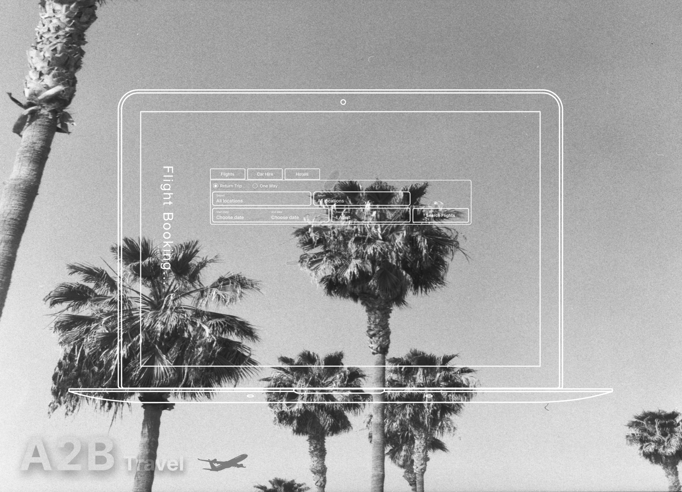
A2B Travel
Fly hassle-free with A2B Travel – your go-to for easy online booking and fewer restrictions with a fresh redesign.
Client
A2B Travel
Project Type
Research and design project
My Role
Responsible for user research, analysis, ideating,
UX/UI Design.
Timeline
2023
Design Brief
Meet A2B Travel – a visionary startup project focused on transforming flight booking. Through innovative research and design, I tackle user challenges and streamline the search booking experience.
In this project, I led data research, including competitor analysis, surveys, and user testing, to uncover user pain points, motivations, and usability challenges in flight searches. The result? A sleek, streamlined MVP prototype ready for testing with stakeholders and developers.
The story
Before delving into design solutions, it was important to understand user goals, behaviours and context of users to pinpoint any potential challenges or roadblocks they might encounter while booking a flight online.
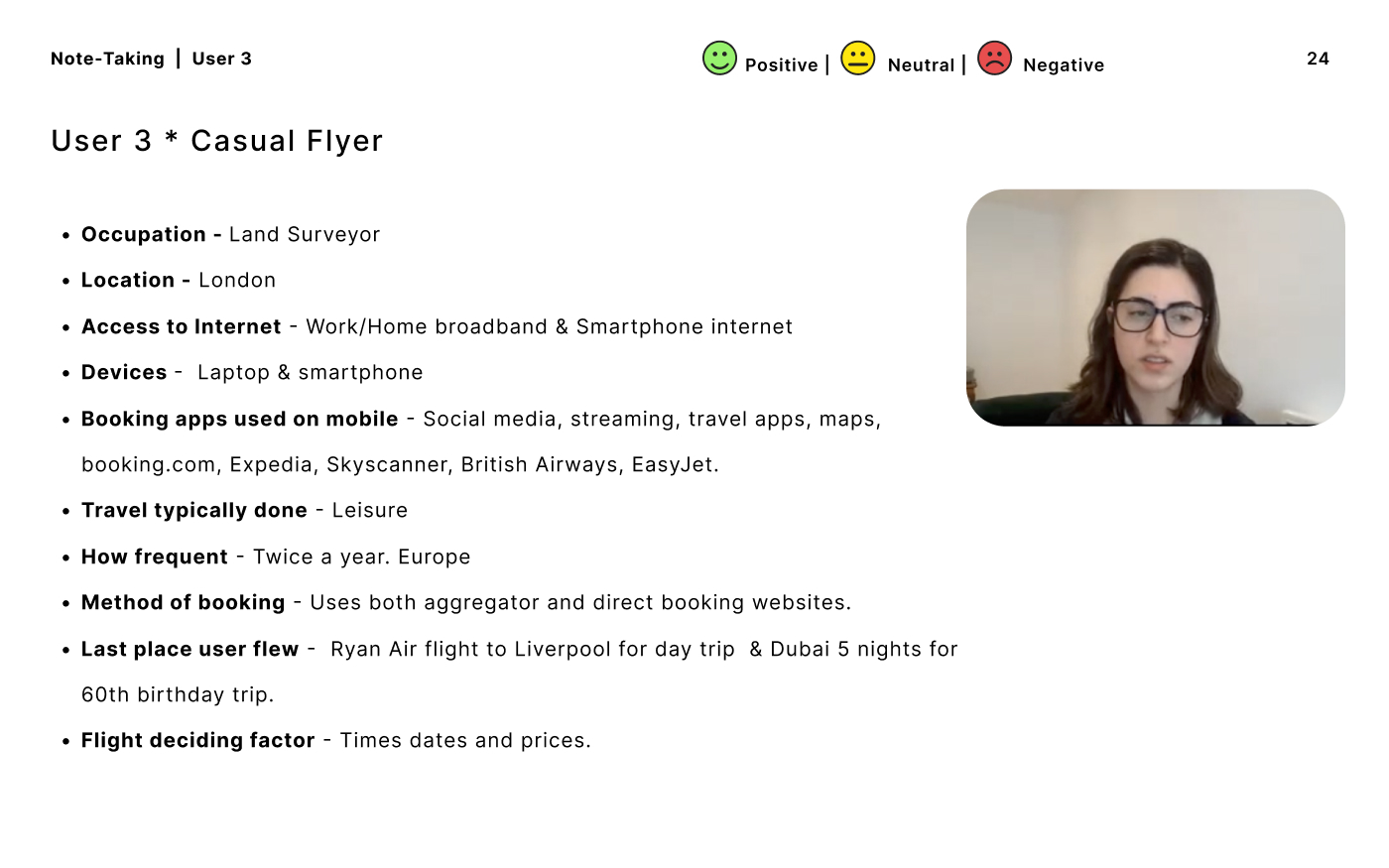
User research
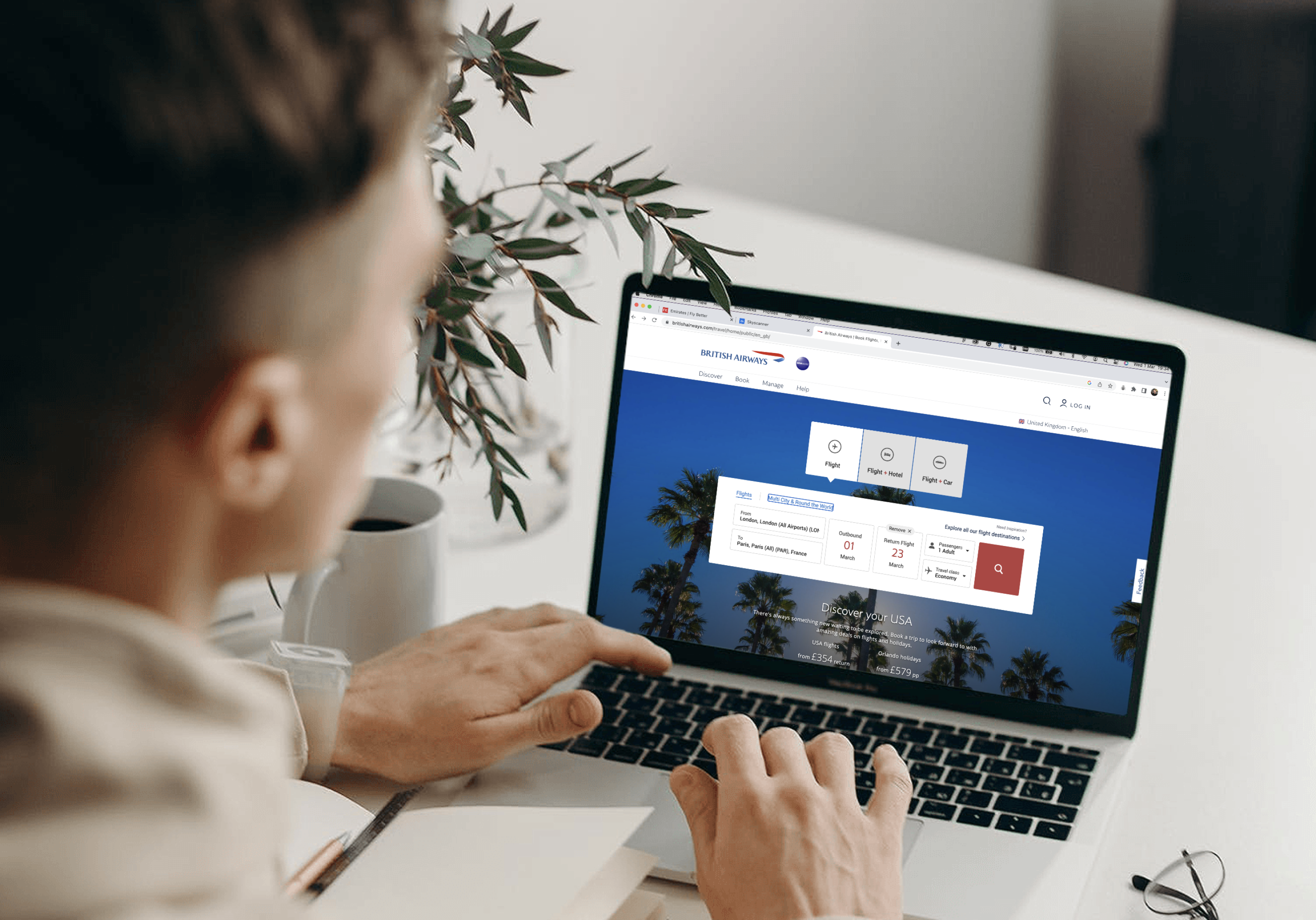
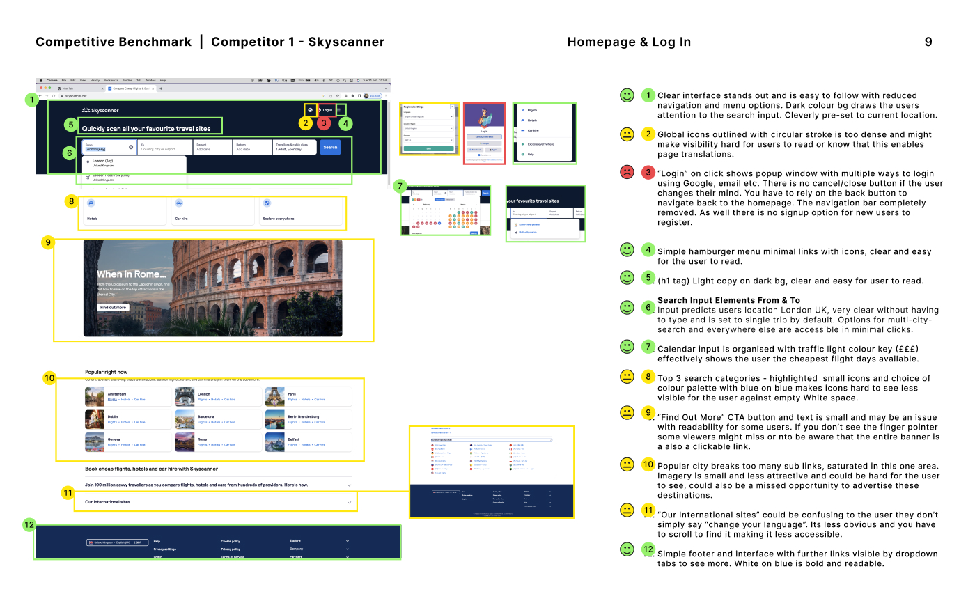
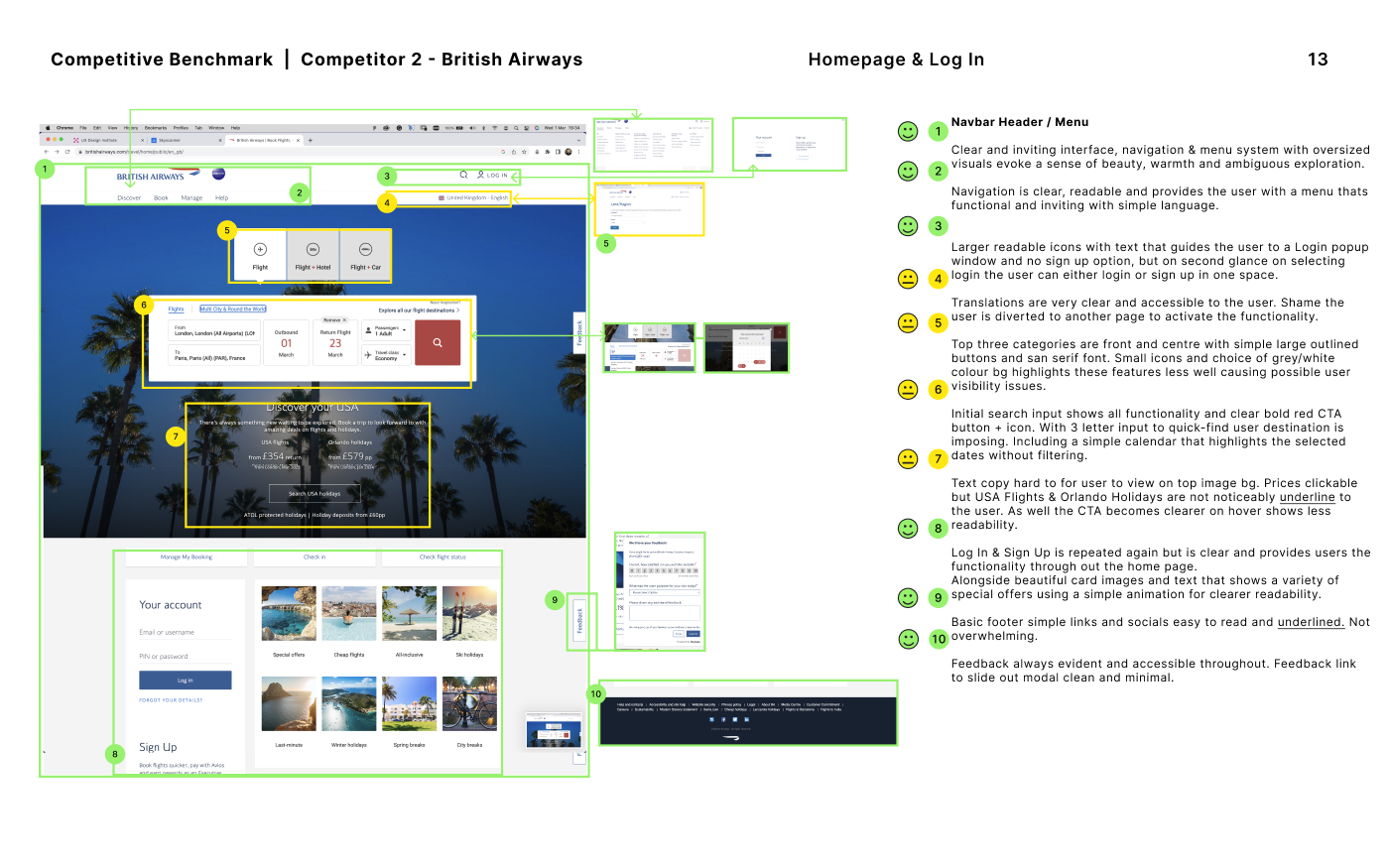
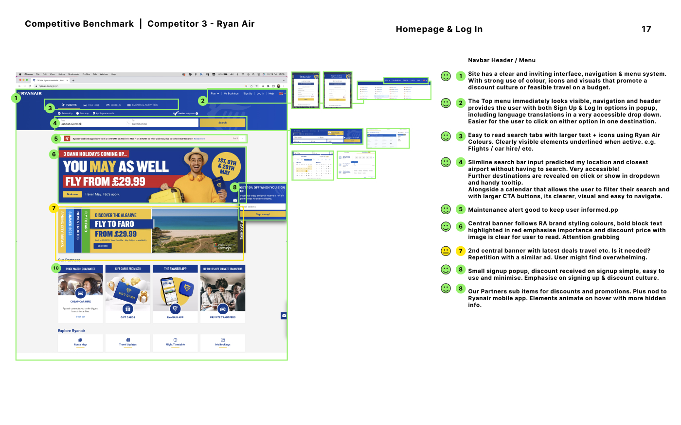
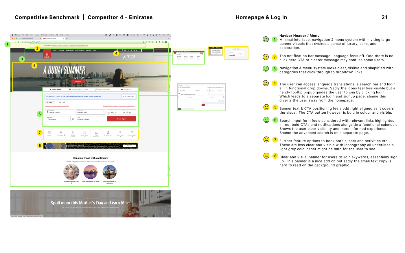
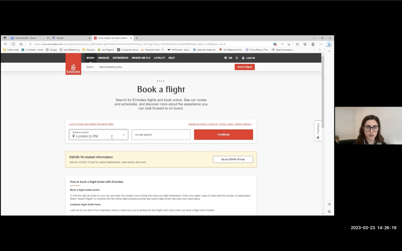
Conducting a benchmark study enabled testing against competitor booking websites like British Airways, Skyscanner, Emirates, and Ryanair to assess their performance, successes, and failures, thereby identifying priority areas for improvement.
Scroll >
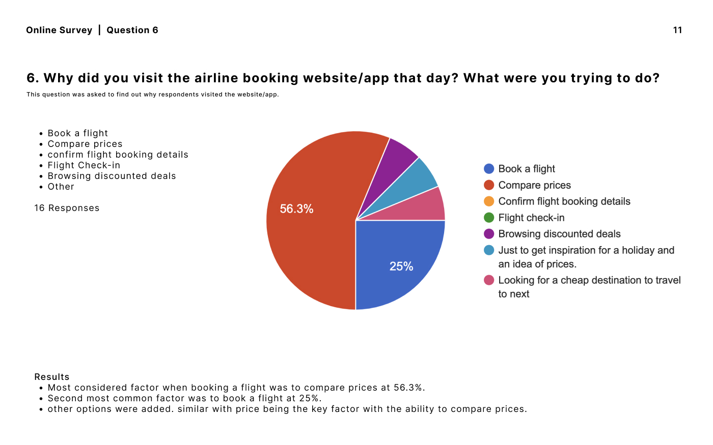
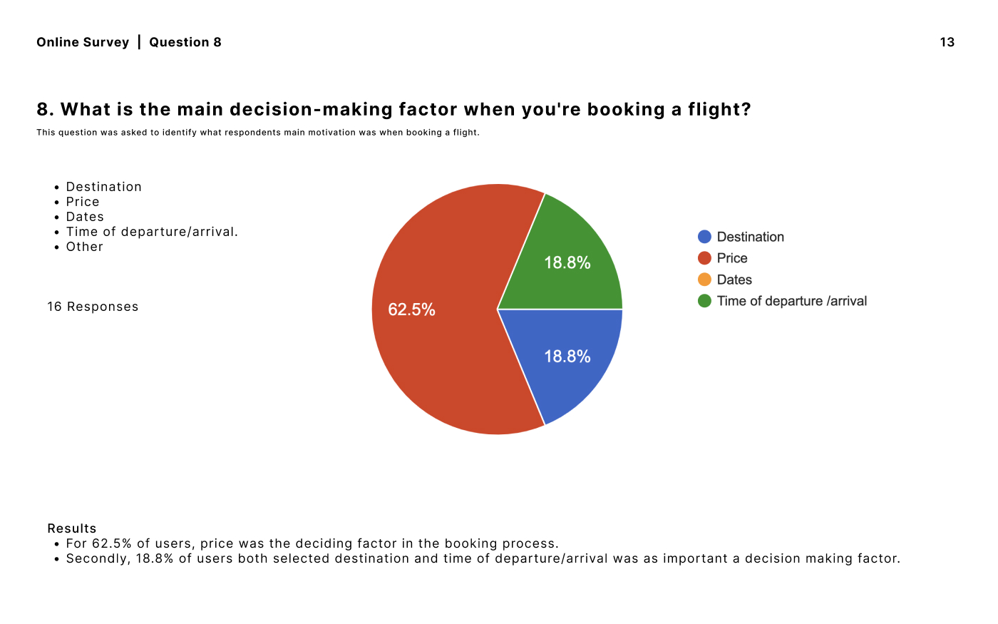
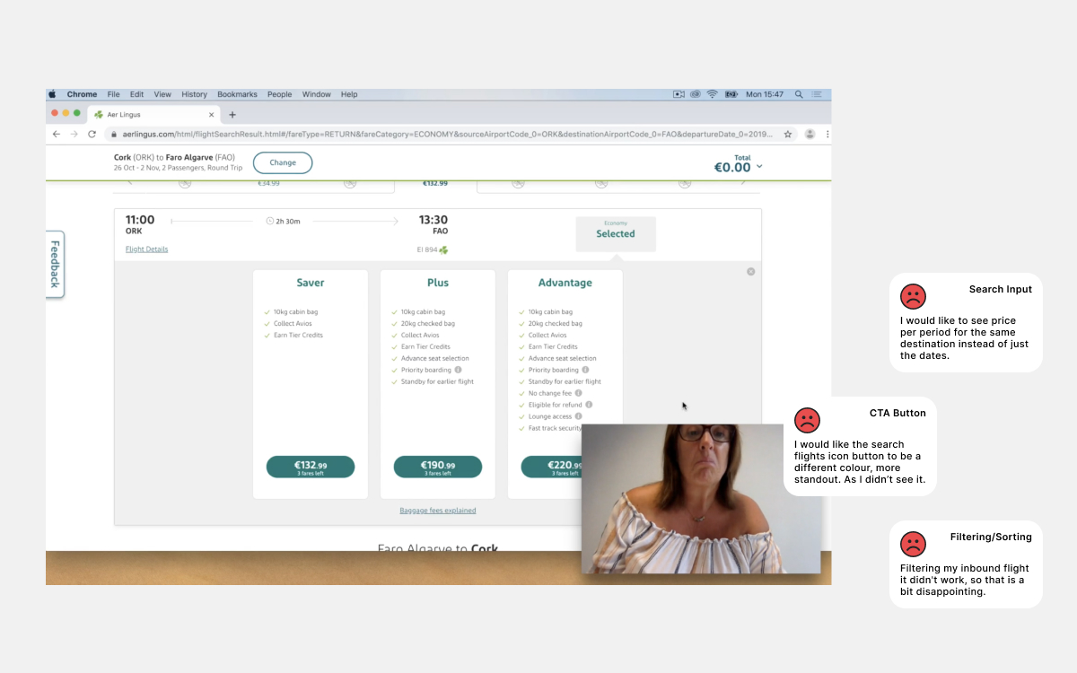
Research Findings
Surveys and user testing feedback revealed unclear language, unintuitive search inputs, hidden baggage fees and usability issues in competitor products, forcing the user to take extra steps and resulting in an increasing rate of abandoned checkout.
“I want to see any hidden costs up front. So if I have to pay to choose a seat then I want to be told, otherwsie I'll look elsewhere.”
“I hate that sites tend to increase their prices if you don't book on your first visit.”
"Clear answers."
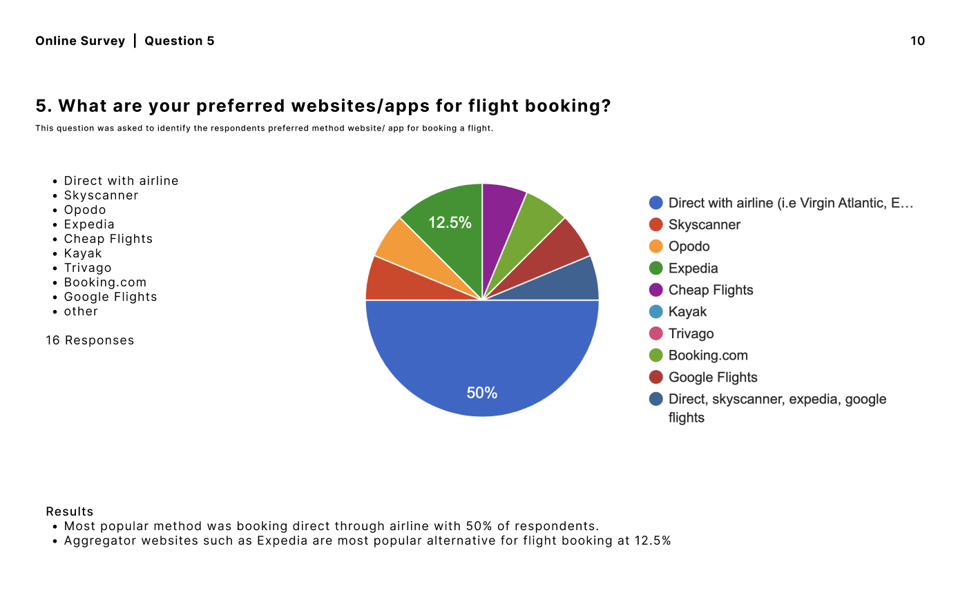
“To be able to search/filter by lowest price flights not just location.”
“More transparent pricing total when searching.”
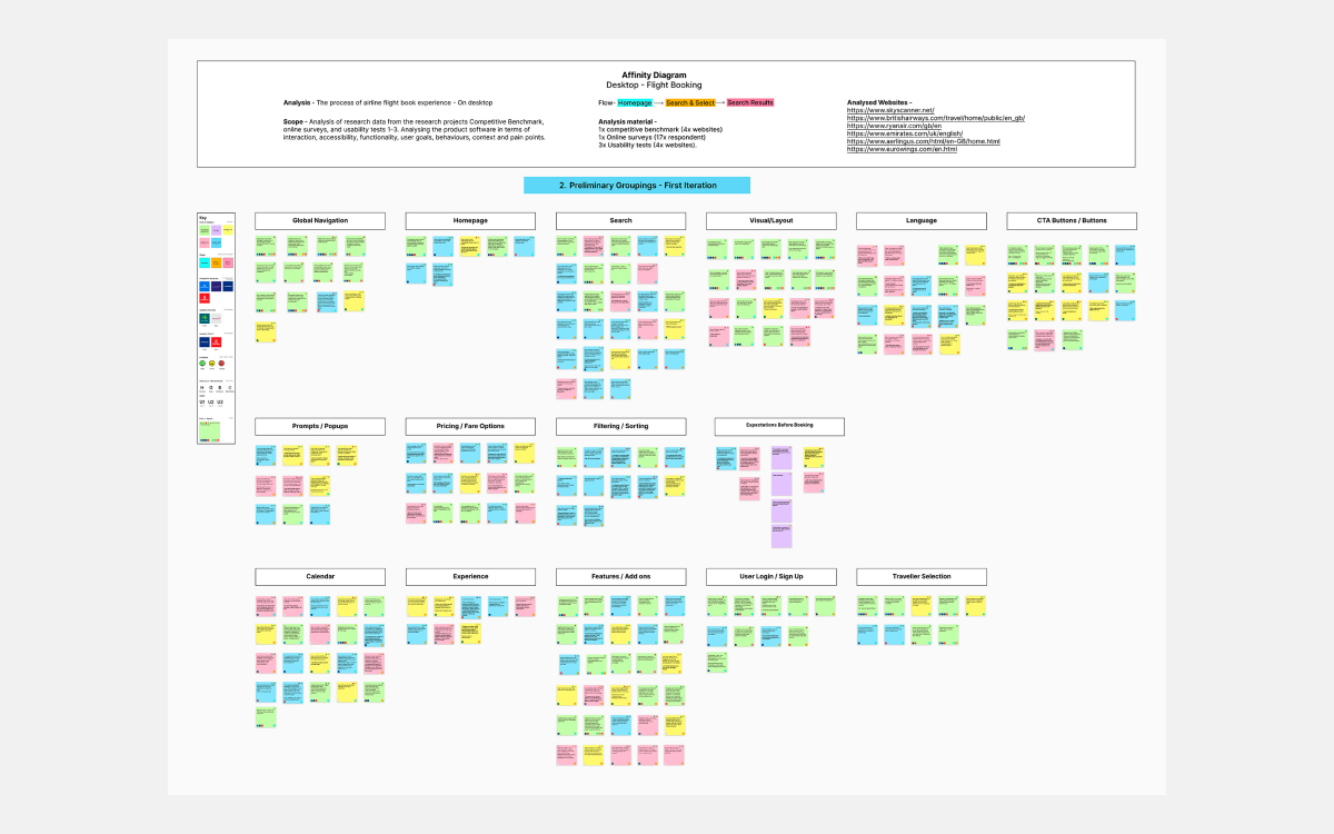
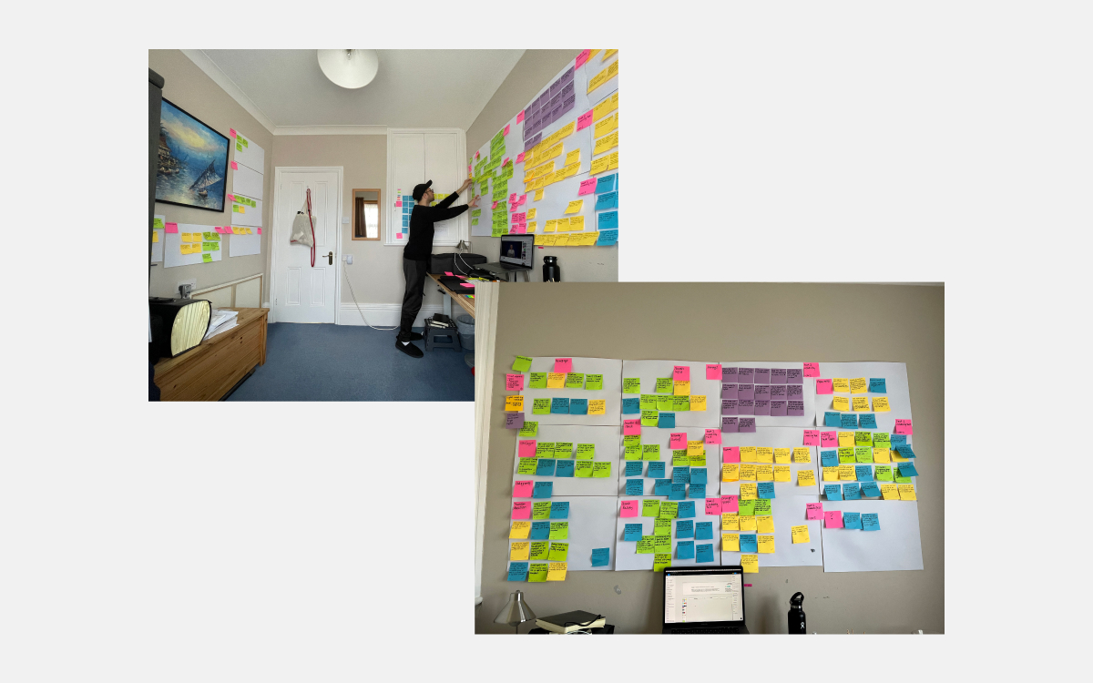
Analysis of unstructured data
Organising unstructured data points, notes and observations gathered during the research phase revealed the search input was a high-impact issue that required further improvement.
Findings
Search input and CTA functionality lacked clarity, readibility and guidance.
“If I started typing in the search field, it should eliminate the selection with the remaining options based on the characters I have entered, making it easier to search. So why don't I have that option.”
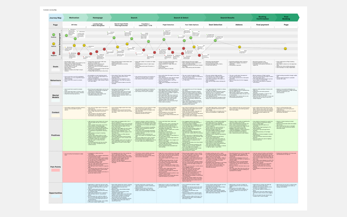
Understanding User Journey
Next, conducting a customer journey map helped to demonstrate the sequence of steps the user went through to complete their goal. This process highlighted user pain points, behaviours and emotional reactions based on their experience.
Findings
Further analysis of journey map data confirmed that search input and filtering, calendar and CTA button functionality were the top three usability issues that users struggled with on competitor site home screens. This presented an opportunity for A2B travel to reduce user friction and improve the design of the home screen search fields.
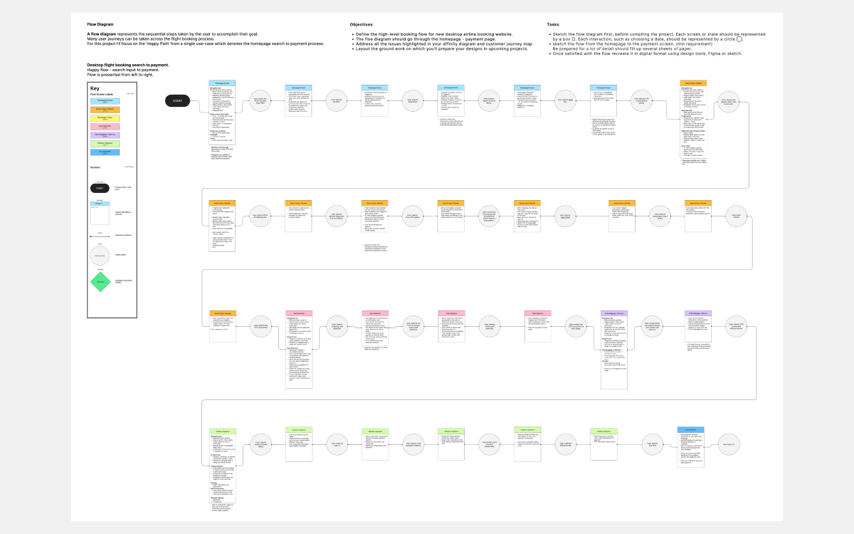
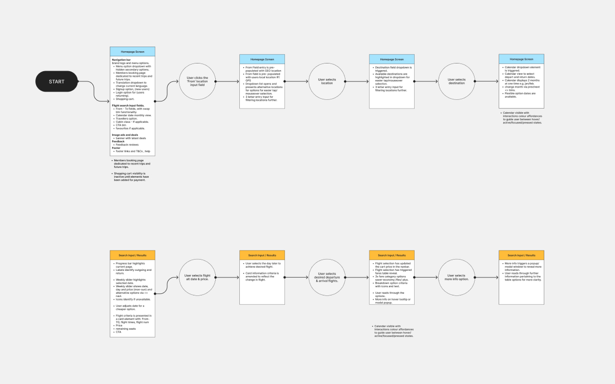
User Flow
I streamlined the user flow by reducing steps in the home screen search input, ensuring a more efficient process. This created a happier path while maintaining similar constraints to those of competitor services.
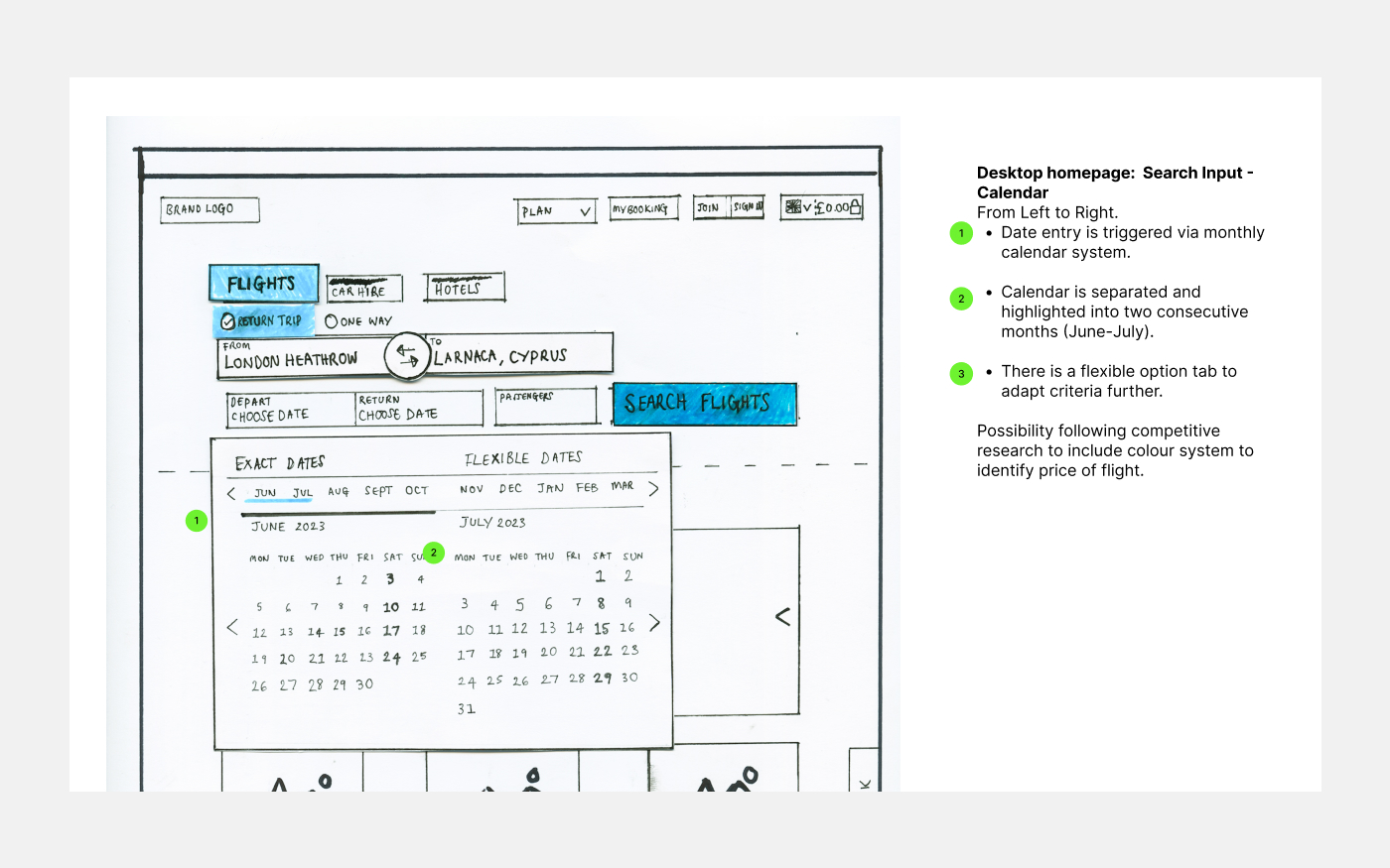
Interaction Sketches
Now with clear insights, I could generate some quick interaction sketches to convey my design thinking with ideas specifically to streamline the search input functionality and improve CTA button language and visibility.
This illustrates the user's journey through the refined user flow and identifying each element and its use before building out low-fidelity wireframes.
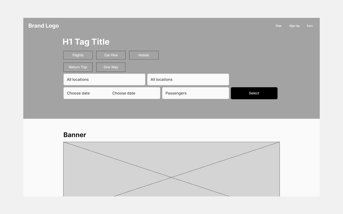
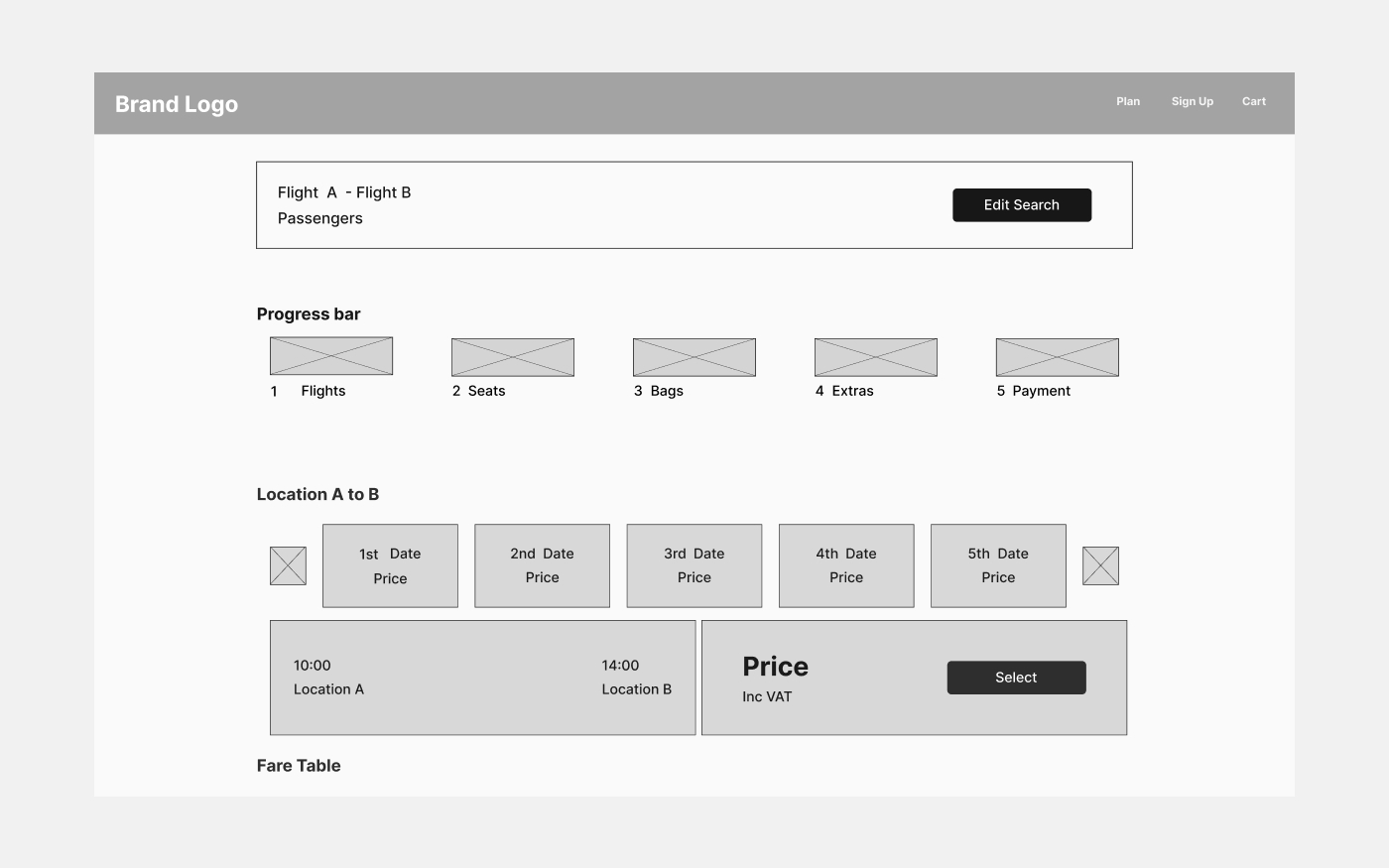
Lofi Wireframes
Next, I crafted low-fidelity wireframes for A2B Travel, drawing inspiration from competitor websites. These early visuals allowed for a comparison to gauge how A2B Travel might stack up against its competitors, before fine-tuning designs in high-fidelity prototypes.
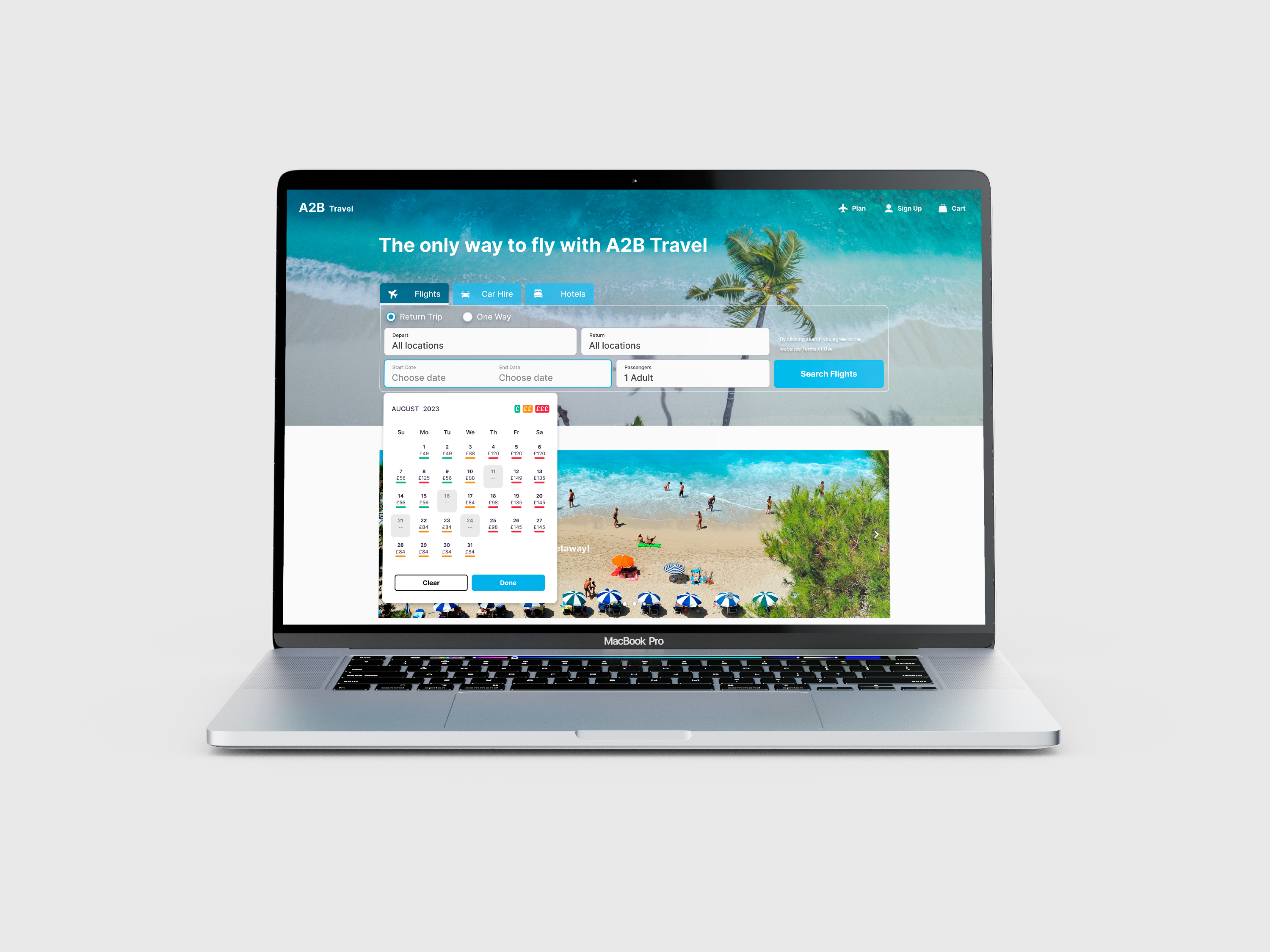
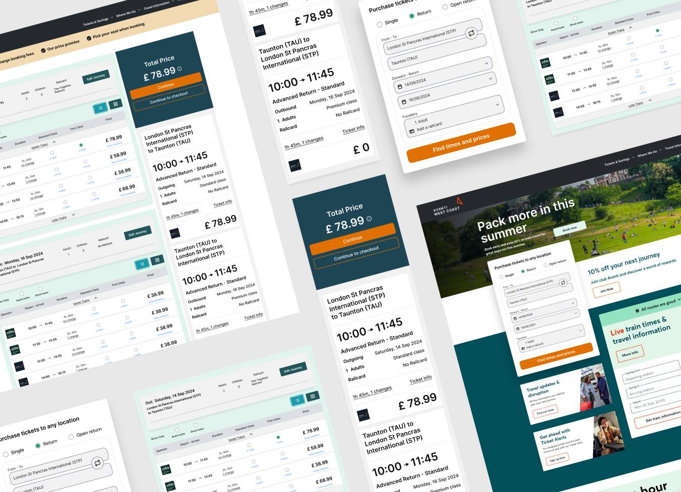
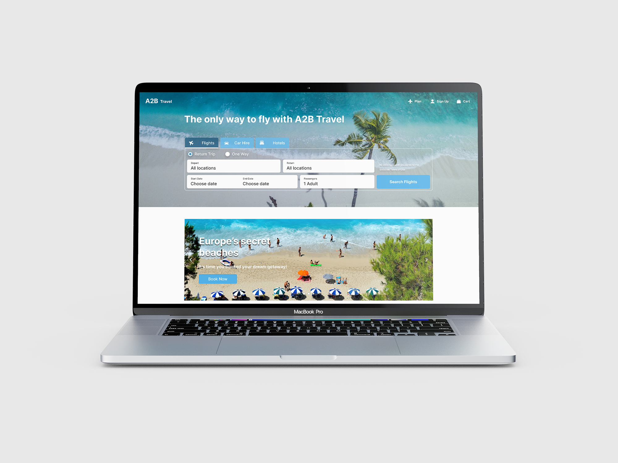
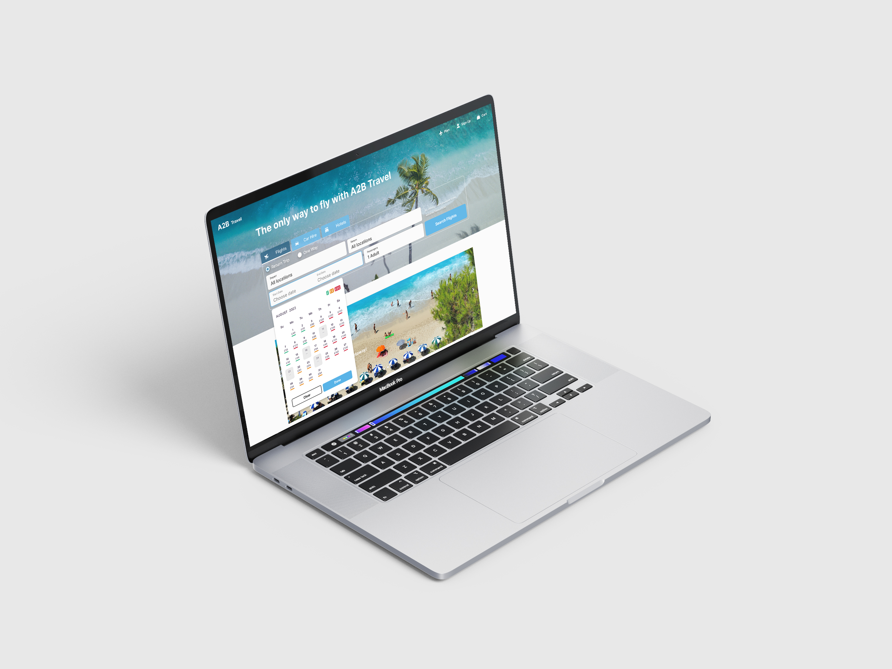
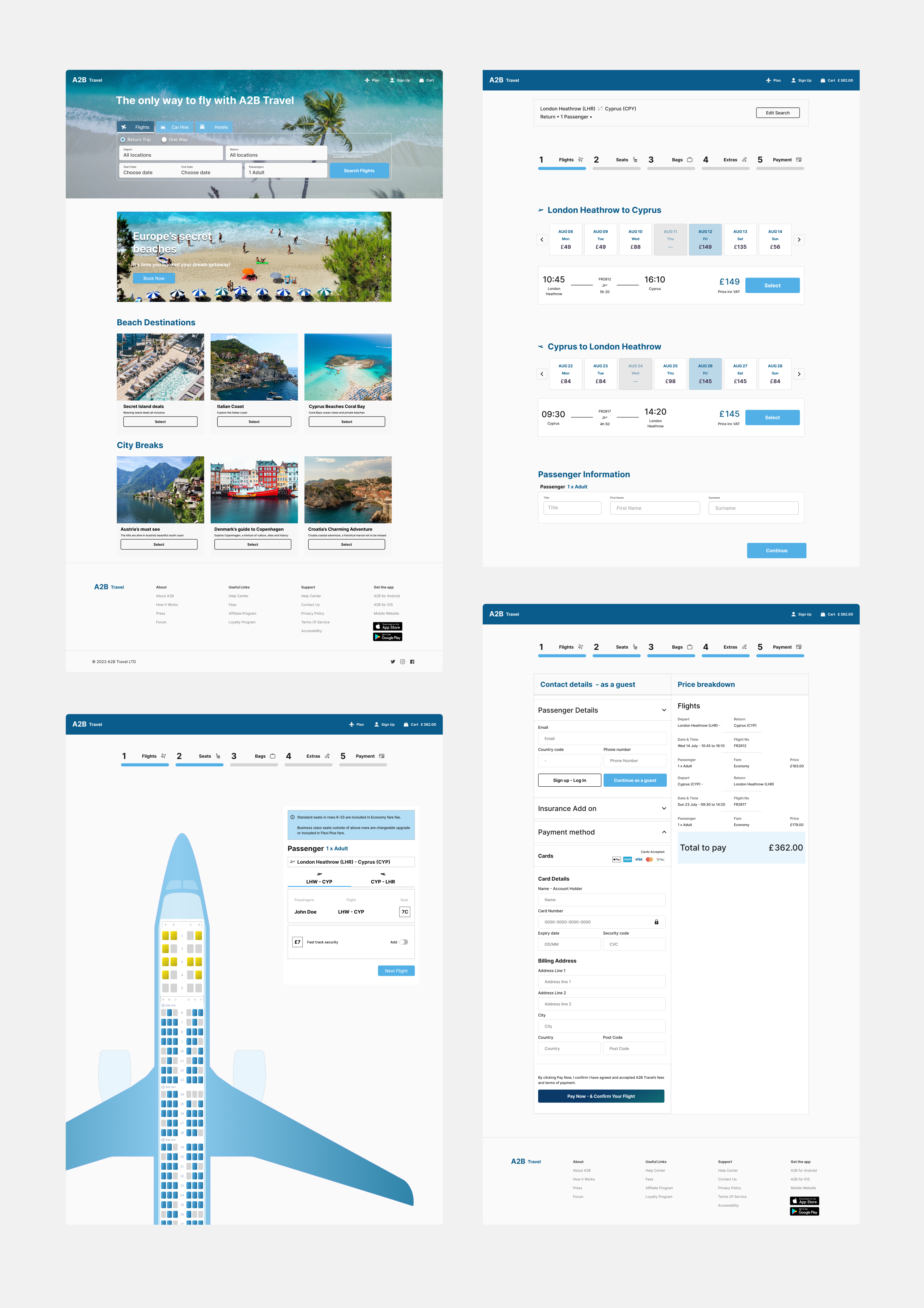
Prototypes
I proceeded to design high-fidelity prototypes to reflect how the finished product might look and to validate the effectiveness of my design solutions and interactions. This step ensured that the proposed solutions effectively addressed the problem and reduced risks with another round of user testing before sharing a handover with stakeholders and developers.
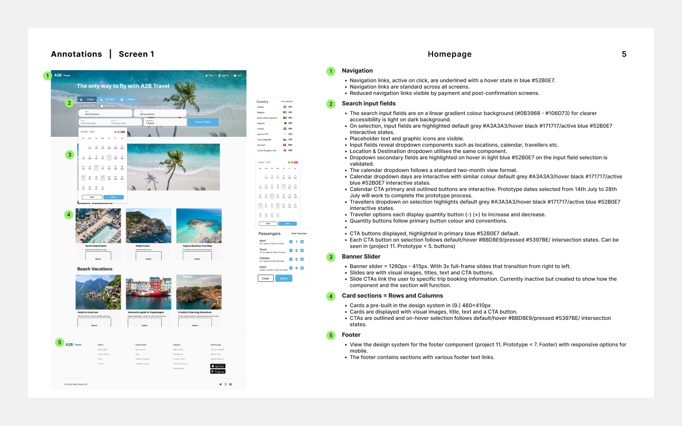
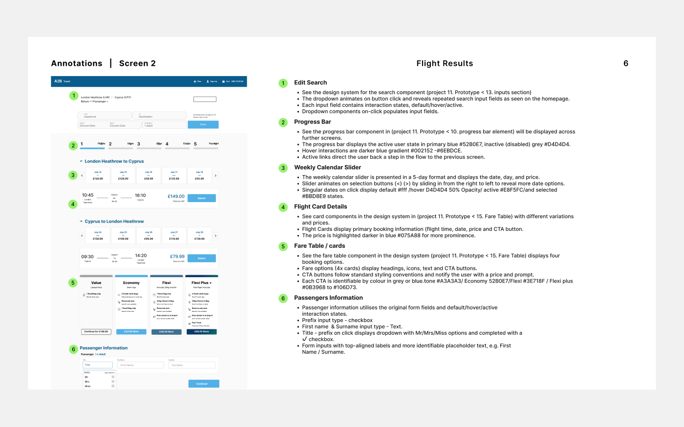
Annotations
To avoid guesswork, I have compiled all pages, components, states and interactions in an annotated handover document alongside high-fidelity prototypes to share with stakeholders and developers. This communicates how the prototype functions and resolves the usability issue encountered in the research process.