Ioannis K Portfolio
An immersive, storytelling photography portfolio and e-shop redesign that offers a seamless, interactive user experience.
Project Type
Desktop and mobile responsive redesign.
My Role
User experience and front-end development.
Timeline
2021
Design Brief
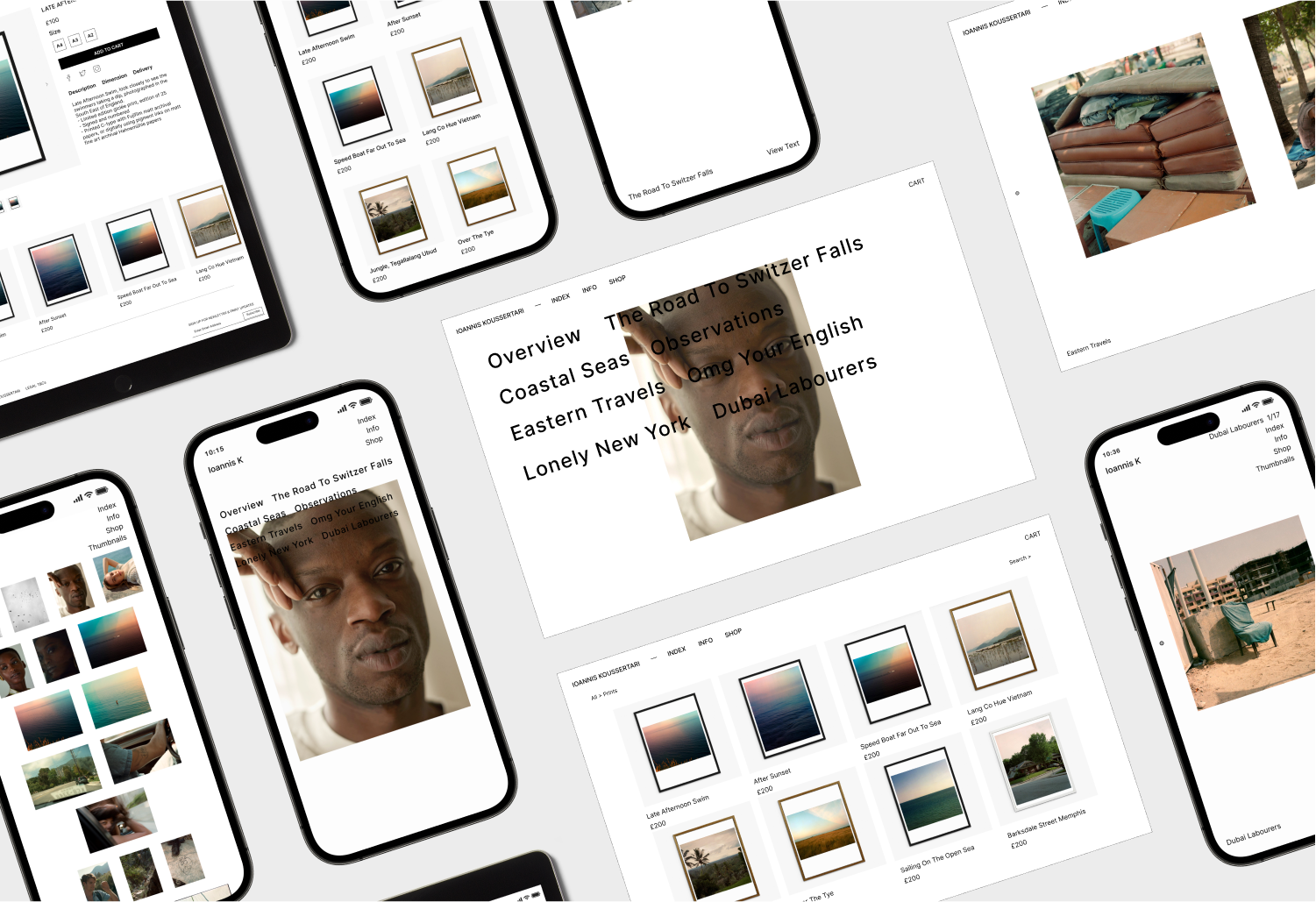
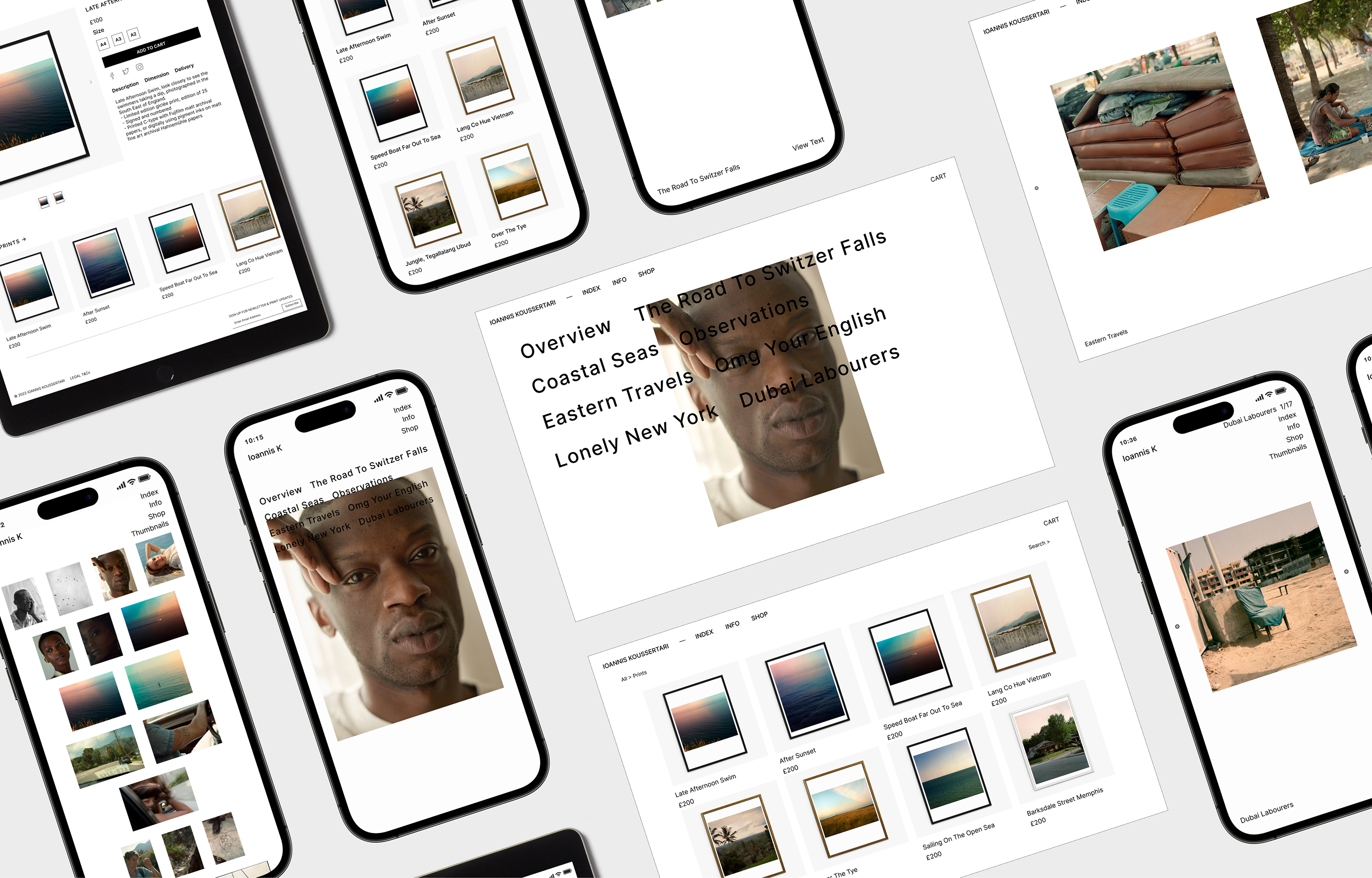
I redesigned Ioannis Koussertari’s portfolio into a dynamic, multi-functional website using Webflow’s intuitive UI tools. Blending minimalist design with powerful functionality, the site now serves as both a captivating showcase for his photography and a fully operational e-commerce shop for limited edition prints. It’s crafted for seamless storytelling, fully responsive across all devices, and optimized for fast load times, delivering an engaging, hassle-free experience for every user.
Original website
Original Product
The original website design was outdated and introduced user issues functionality issues navigating between the homepage and websites subsections.
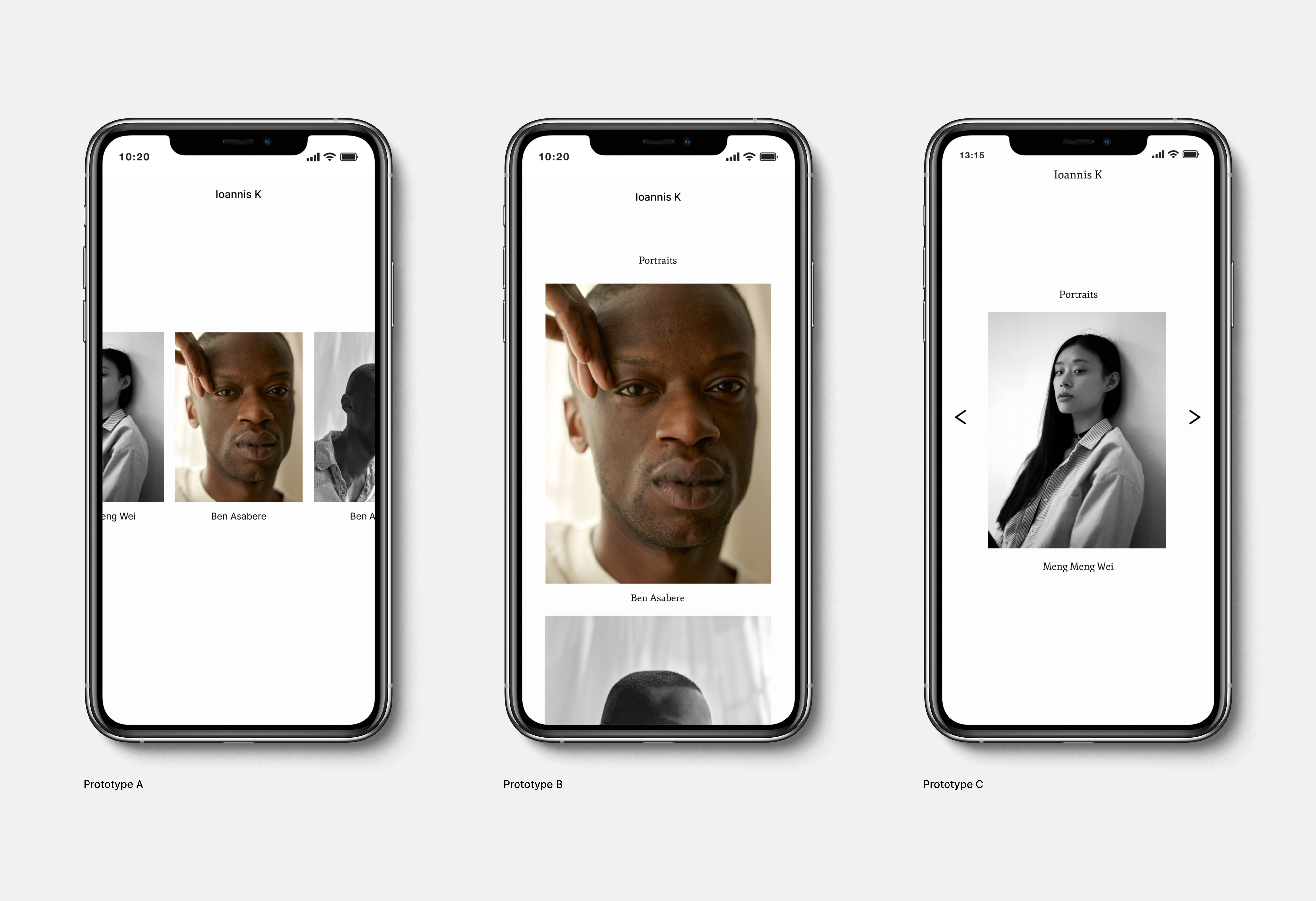
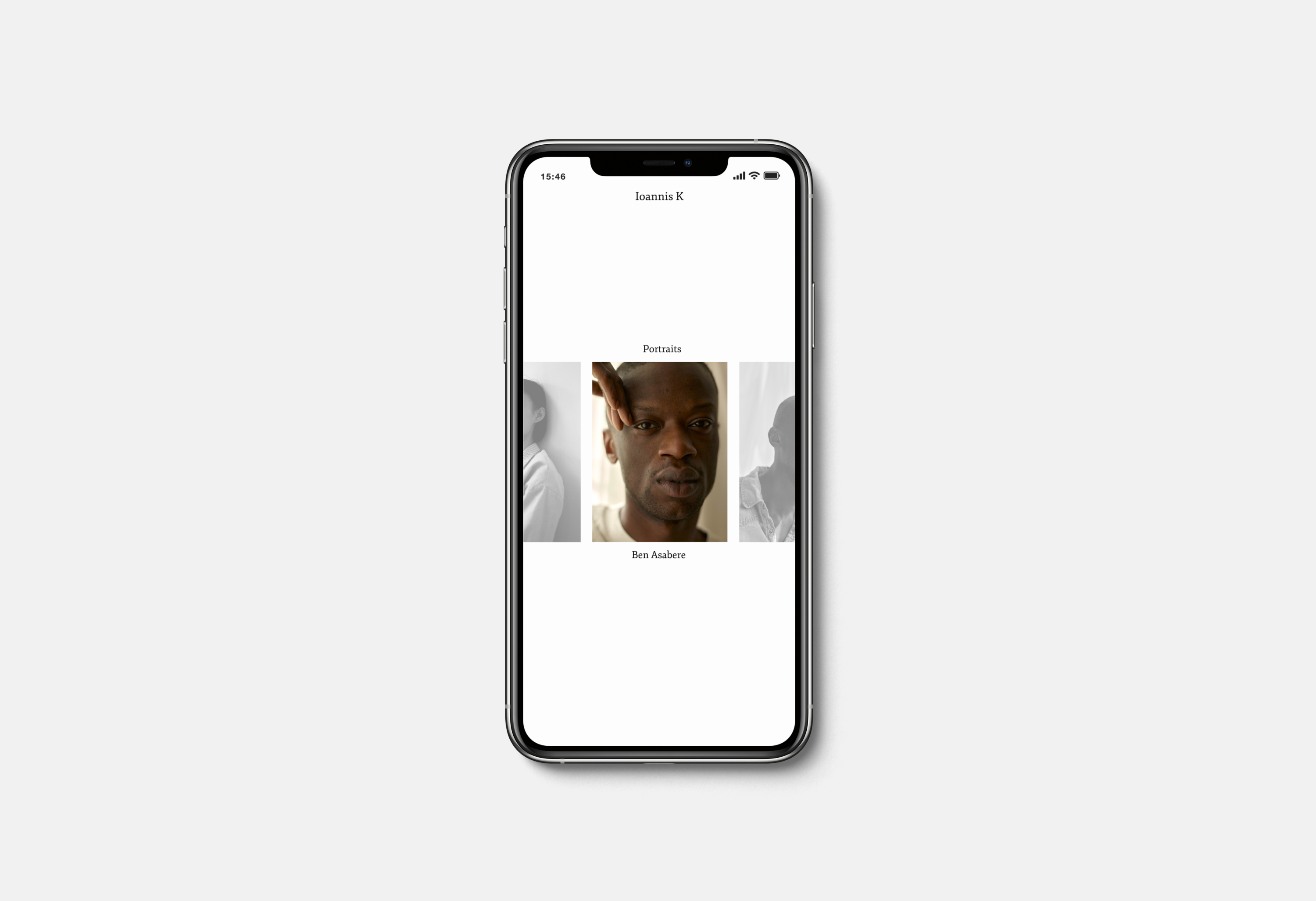
Gallery prototypes
User Research
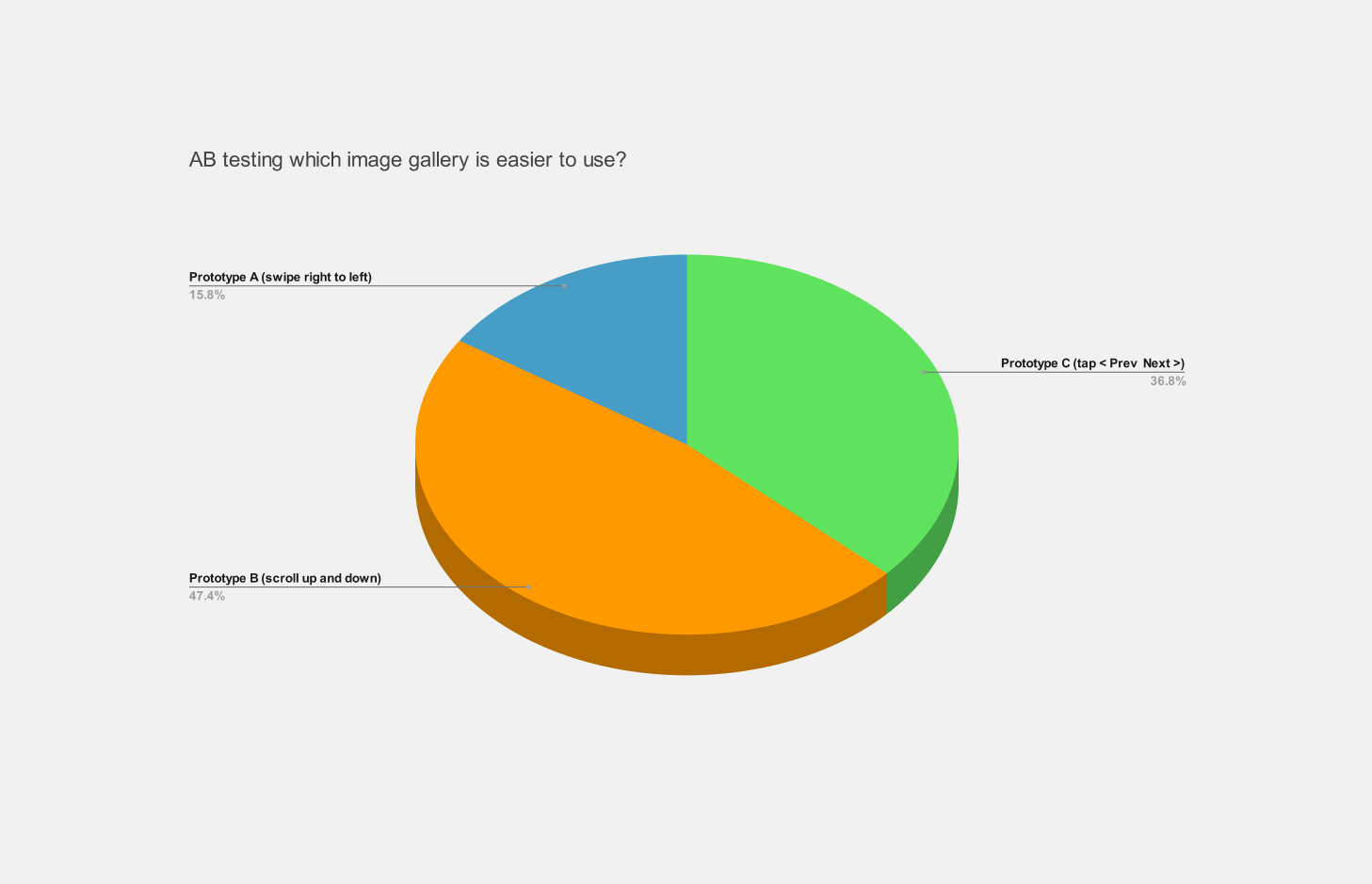
AB multi variant testing prototypes with users showed which image gallery experience users found easier to use.
AB testing results highlighted prototypes B (47.4%) and C (36.8%) were the most popular and provided users with a functional and simplified experience. However, prototype C was the preferred choice as user feedback showed improved usability and aesthetics on mobile devices with tap functionality.
AB test results
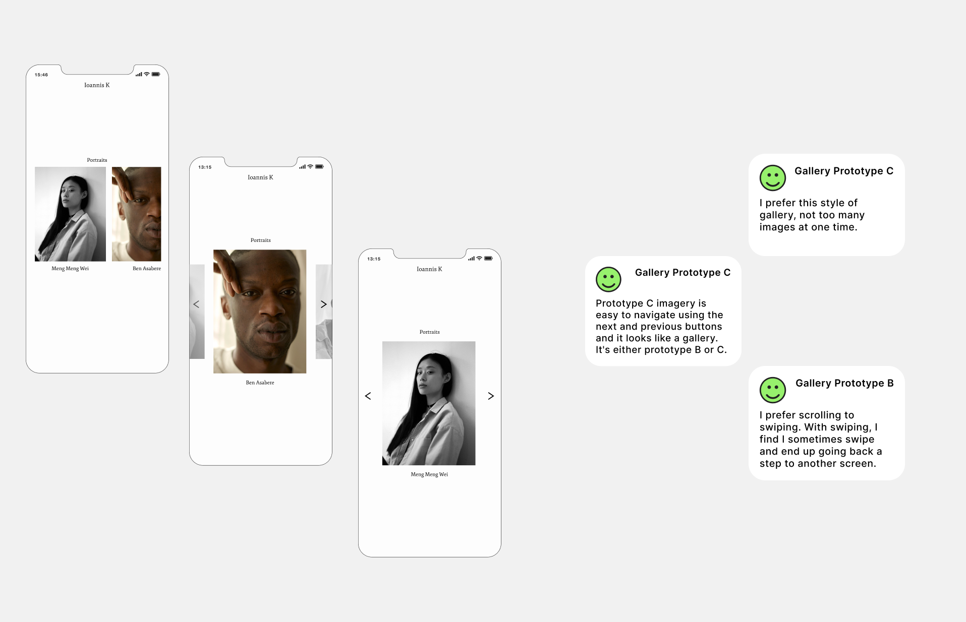
User comments
Goals of the redesign
AB multi variant testing prototypes with users showed which image gallery experience users found easier to use.
I restructured the information architecture and site hierarchy by reducing navigation and making it easier for users to consume. Revealing more functional elements as users progress throughout the interface.
- The main goal was to increase daily activity by improving usability.
- Concentrating on the two use cases, viewing gallery images and reducing payment steps.
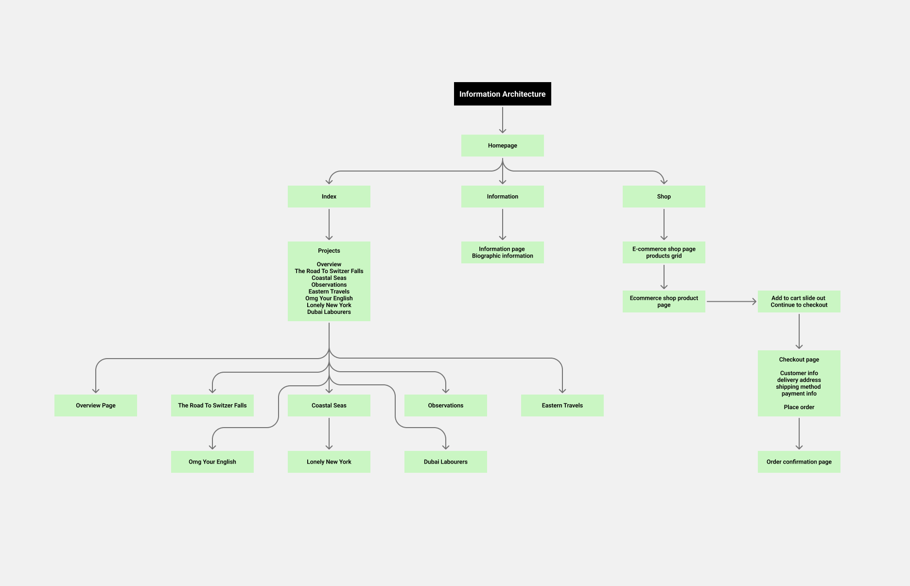
IA
Site hierarchy
IA
Based on the newly adapted information architecture, I reduced steps for users accessing different galleries and payment screens, allowing users to find what they want efficiently.
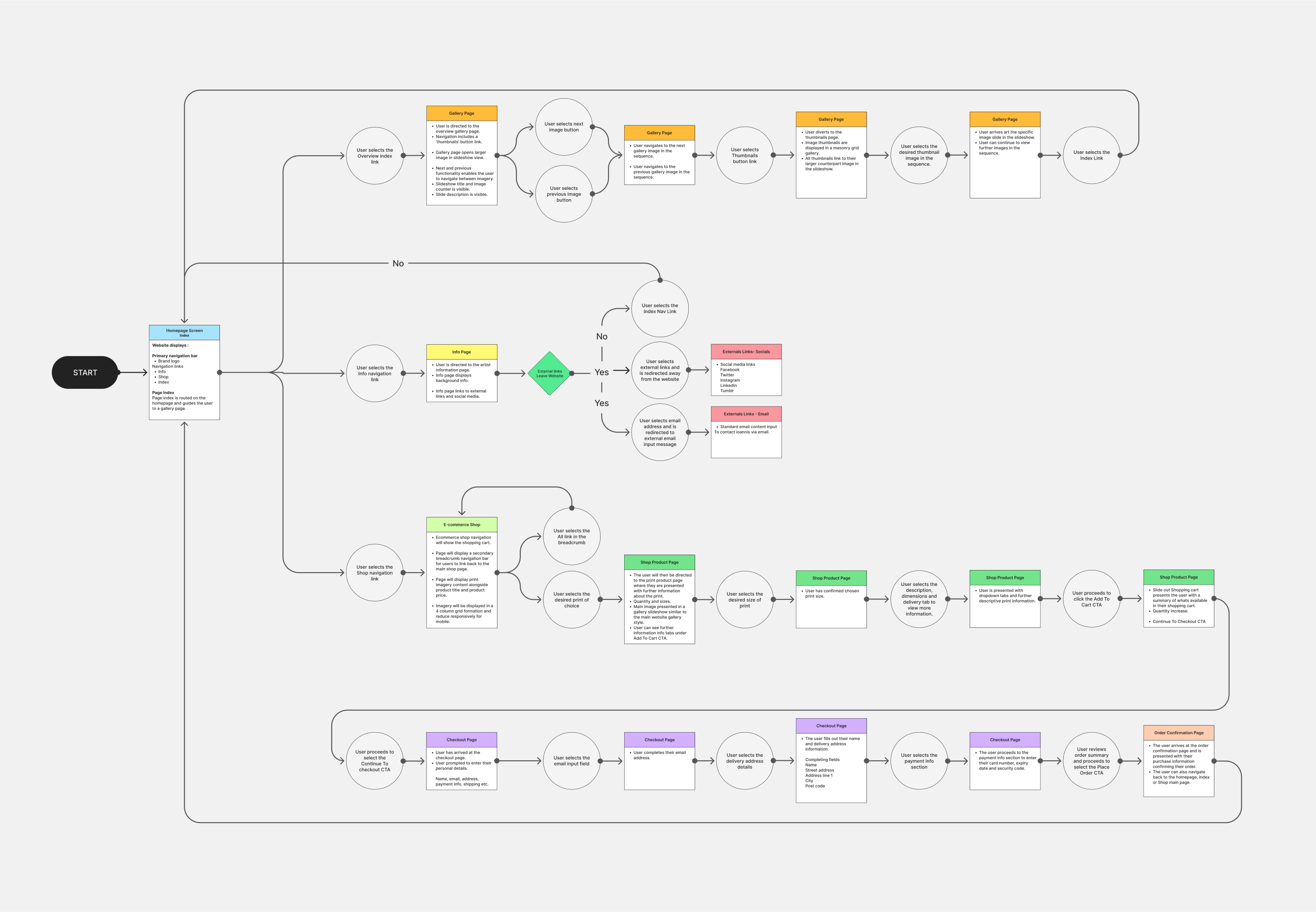
User flow
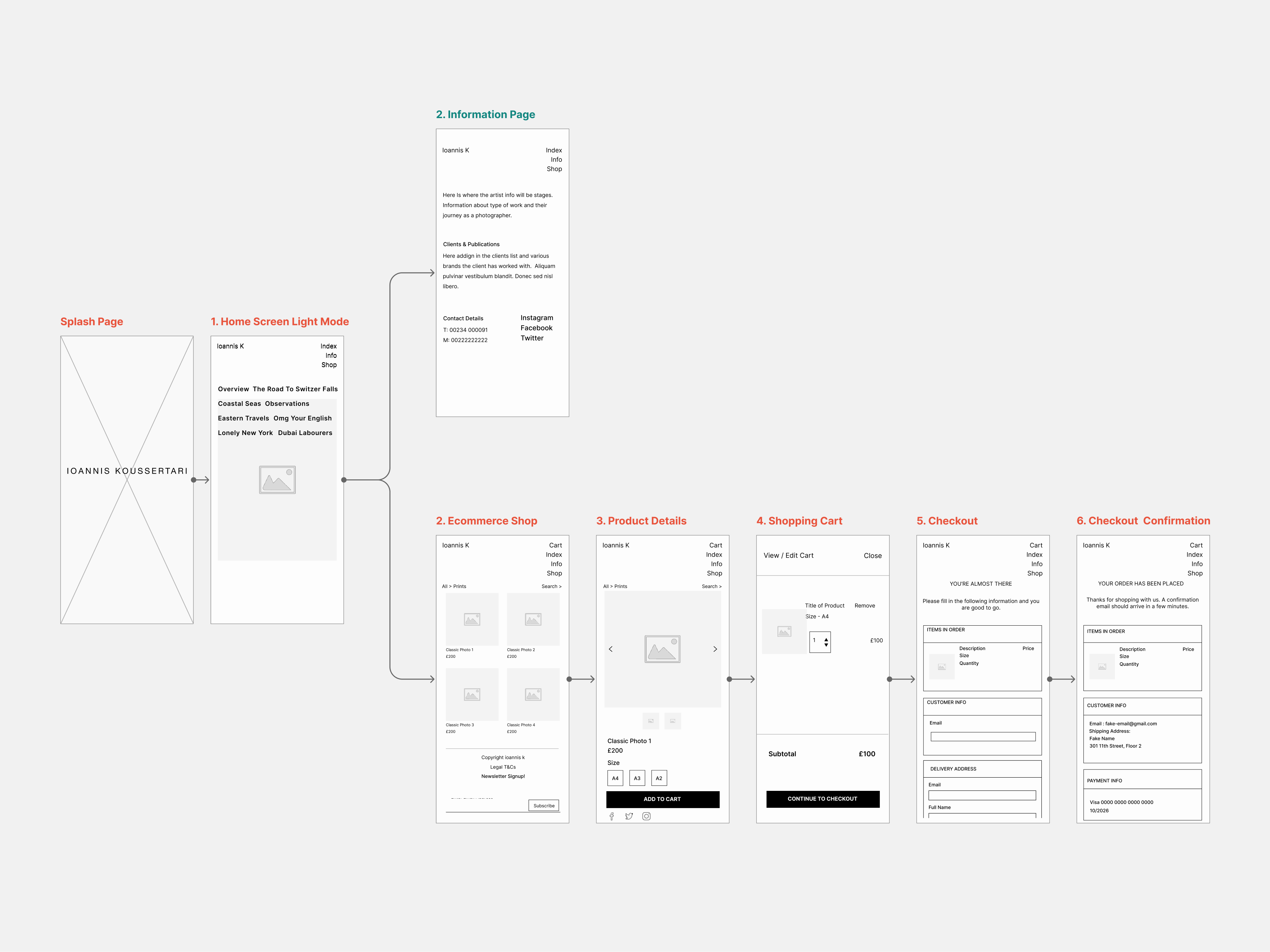
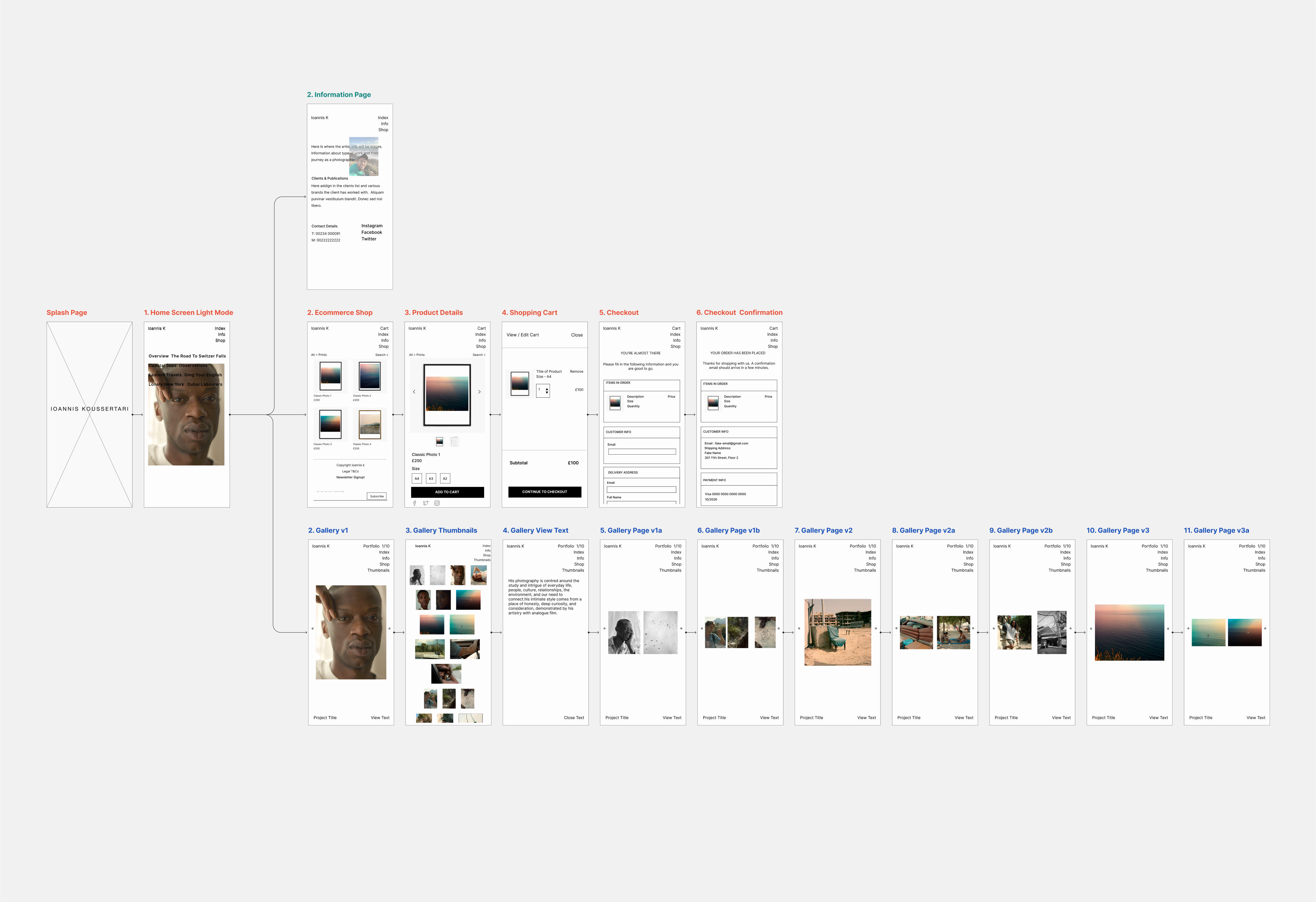
Wireframes
With a more logical flow, this should guide users between viewing imagery and purchasing products with ease now that there are fewer steps in the process.
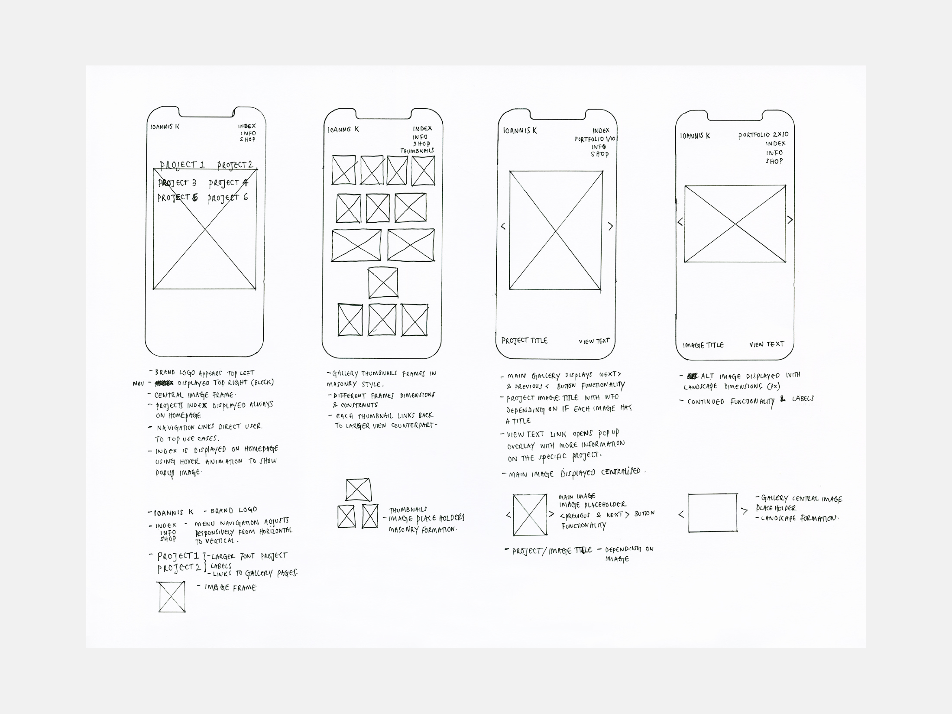
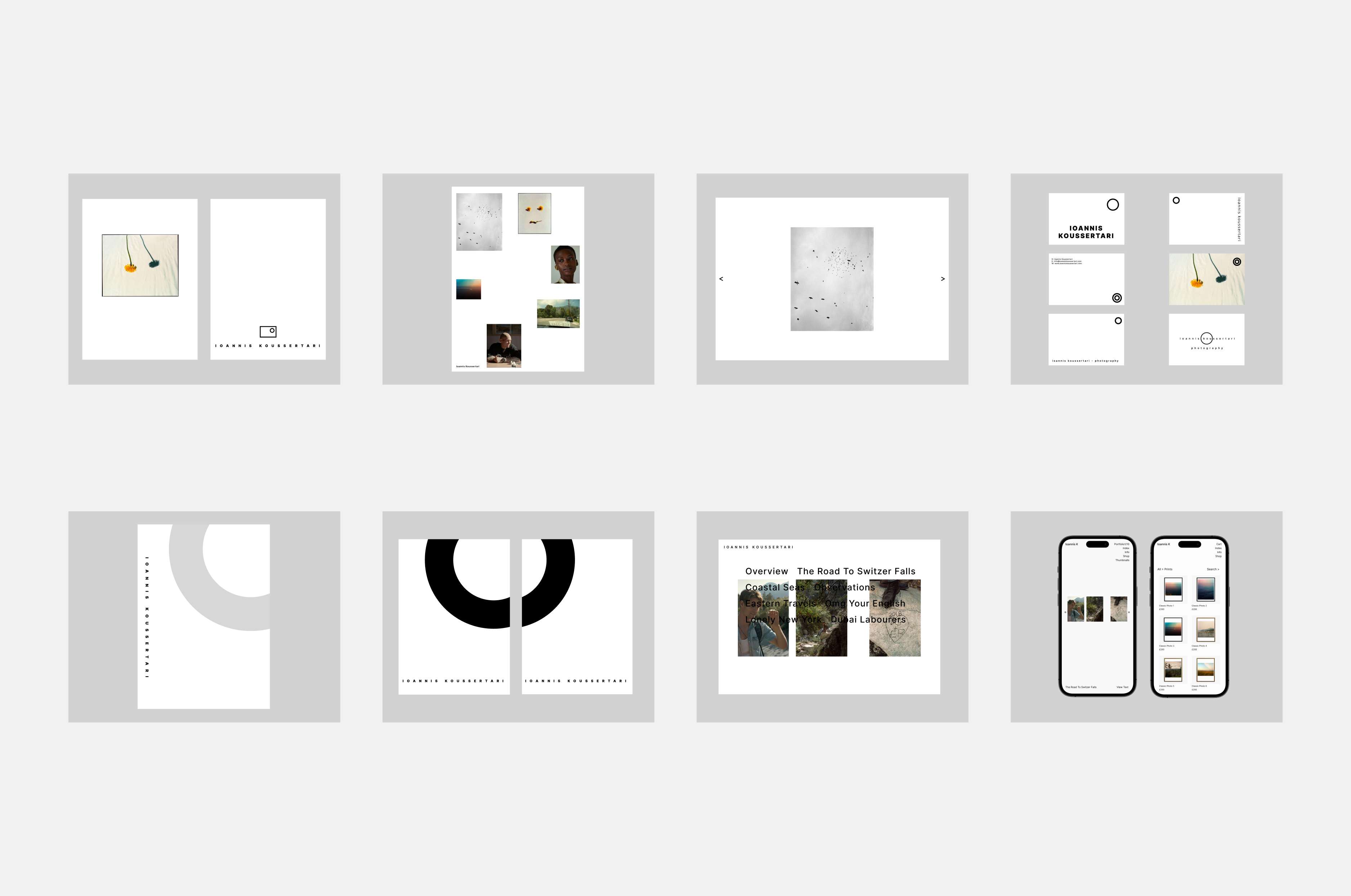
Sketches
Gallery flow lofi wireframes
Prototype
The next step was to prototype the website's image gallery and shop product page initial design from scratch. Keeping it simple yet elevating the original design, utilising more space and modernising style elements, font, colour and icons for a modern feel that would be identifiable when tested with users.
Sketches
Payment flow lofi wireframes
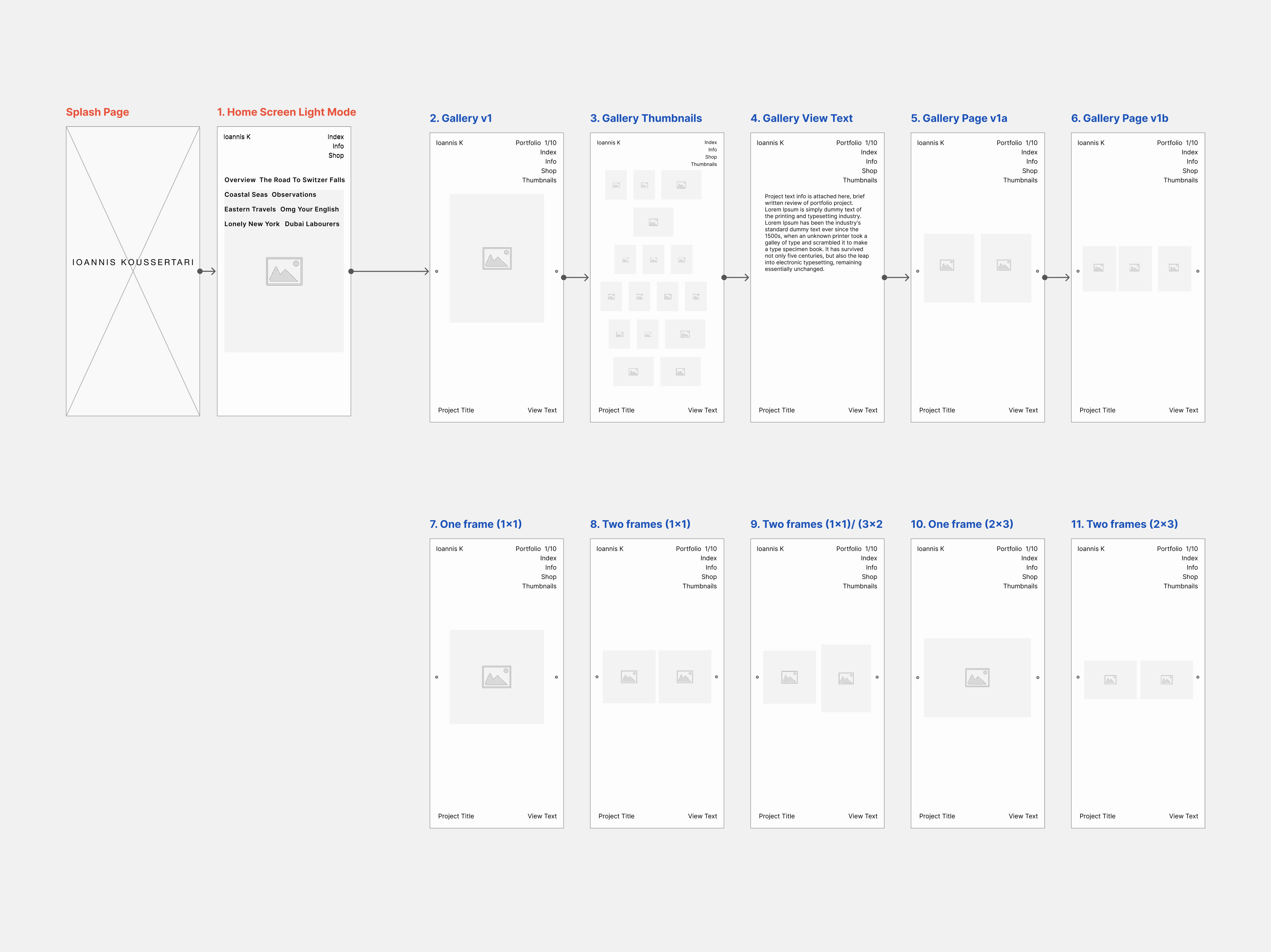
Hifi Mockup
The prototype highlighted interactions and user movements providing users further freedom and control to navigate quickly and efficiently from any section of the website.
Hifi wireframes
Brand Collateral
Digital assets and to promote and support the business online.
Brand Collateral
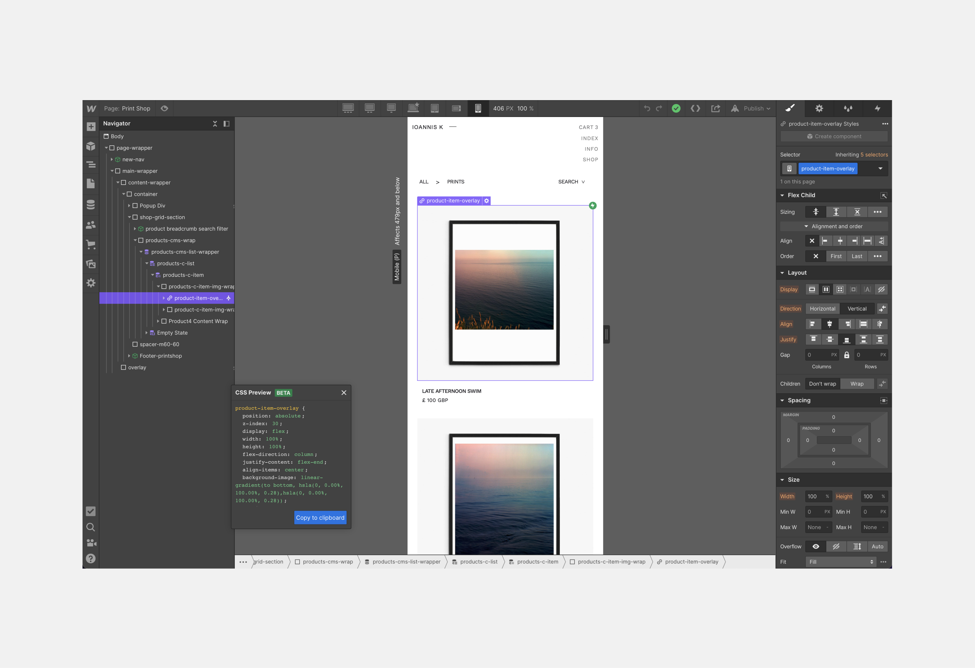
Build
Using Webflows intuitive UI designer tool has allowed the client to adapt the design and styling further without an external developer or coder, although it comes with a learning curve.
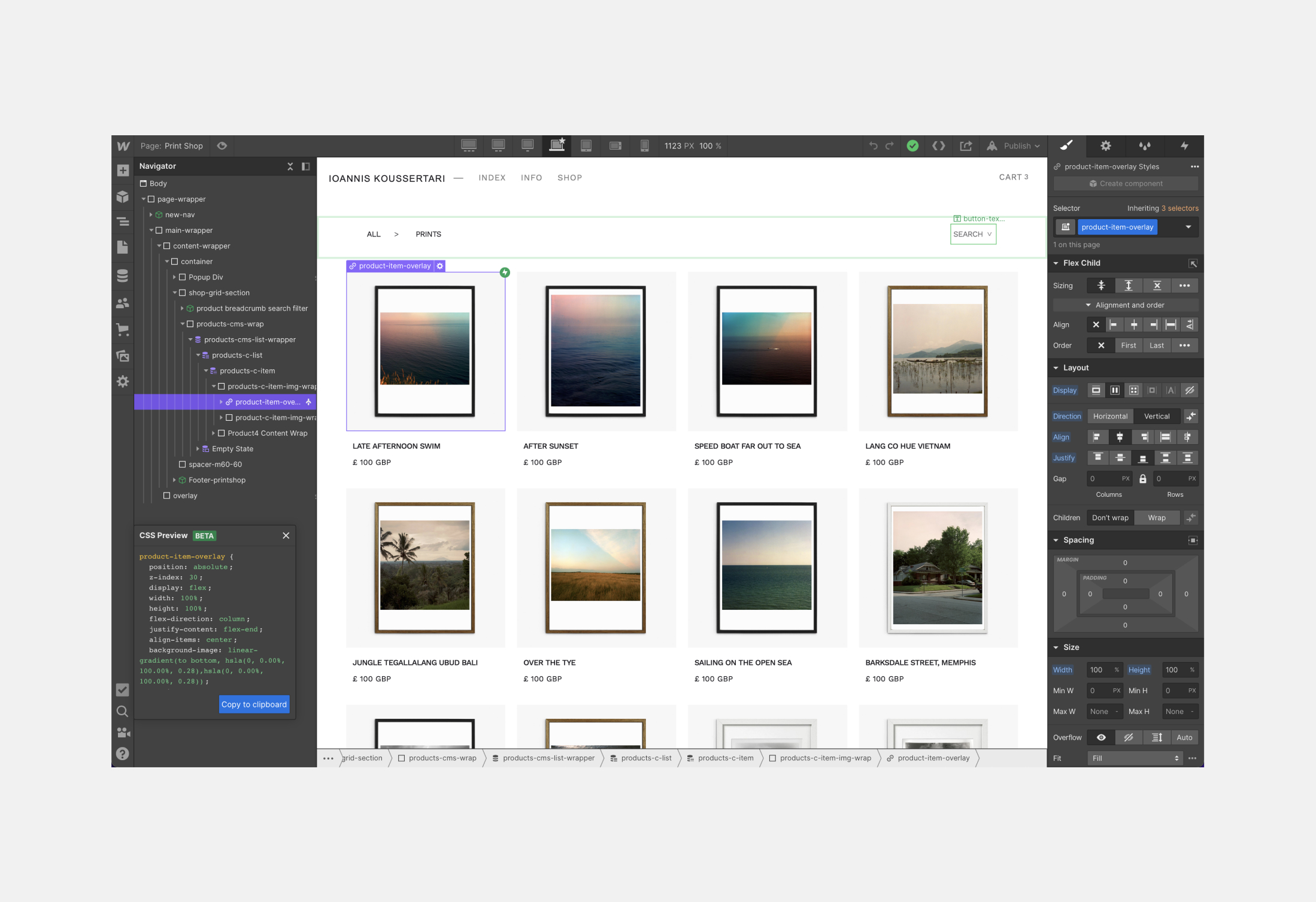
Desktop build
Mobile build
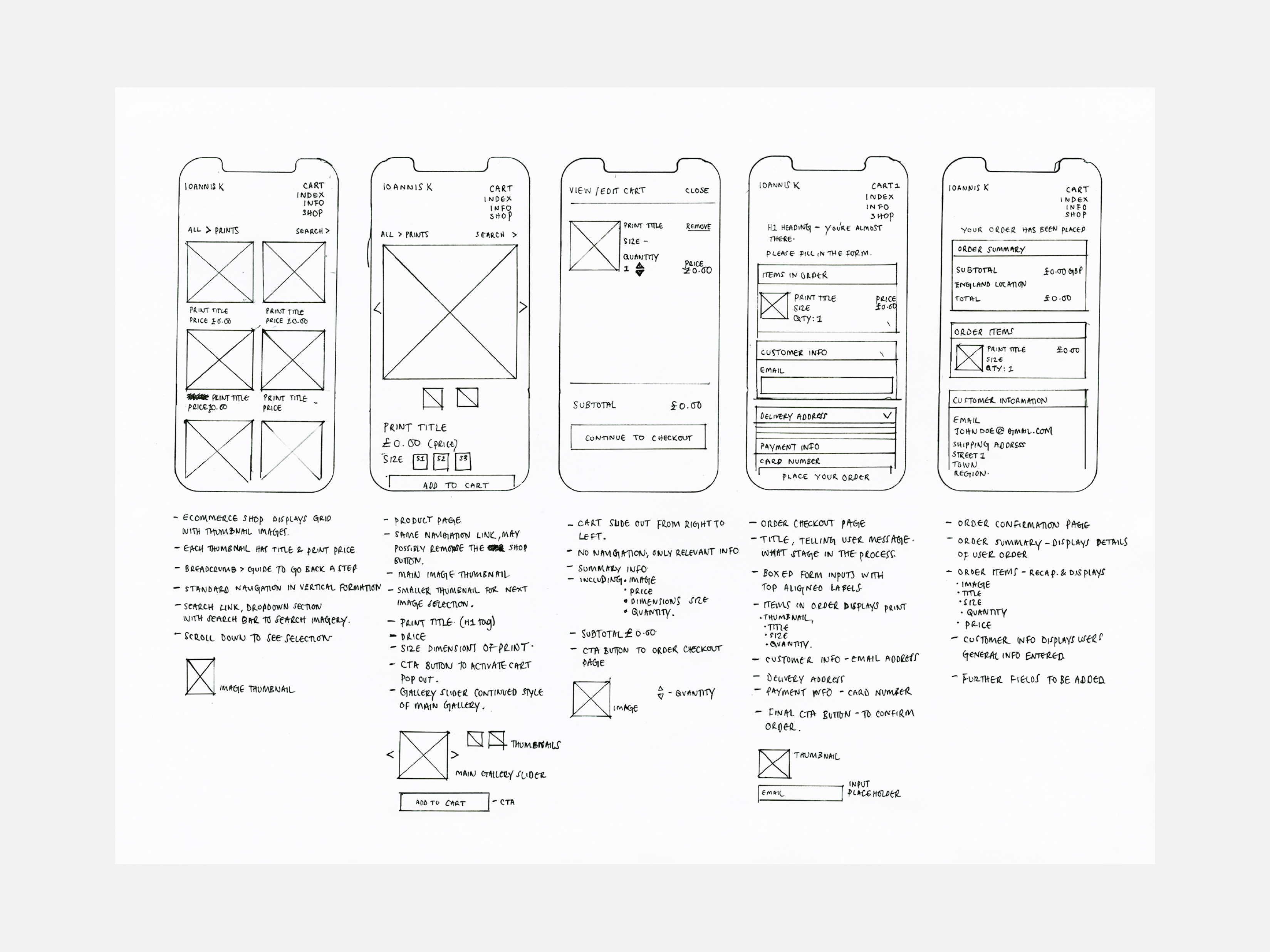
Prototypes
High-fideltity mobile prototypes exploring gallery flow and below e-shop payment screens.
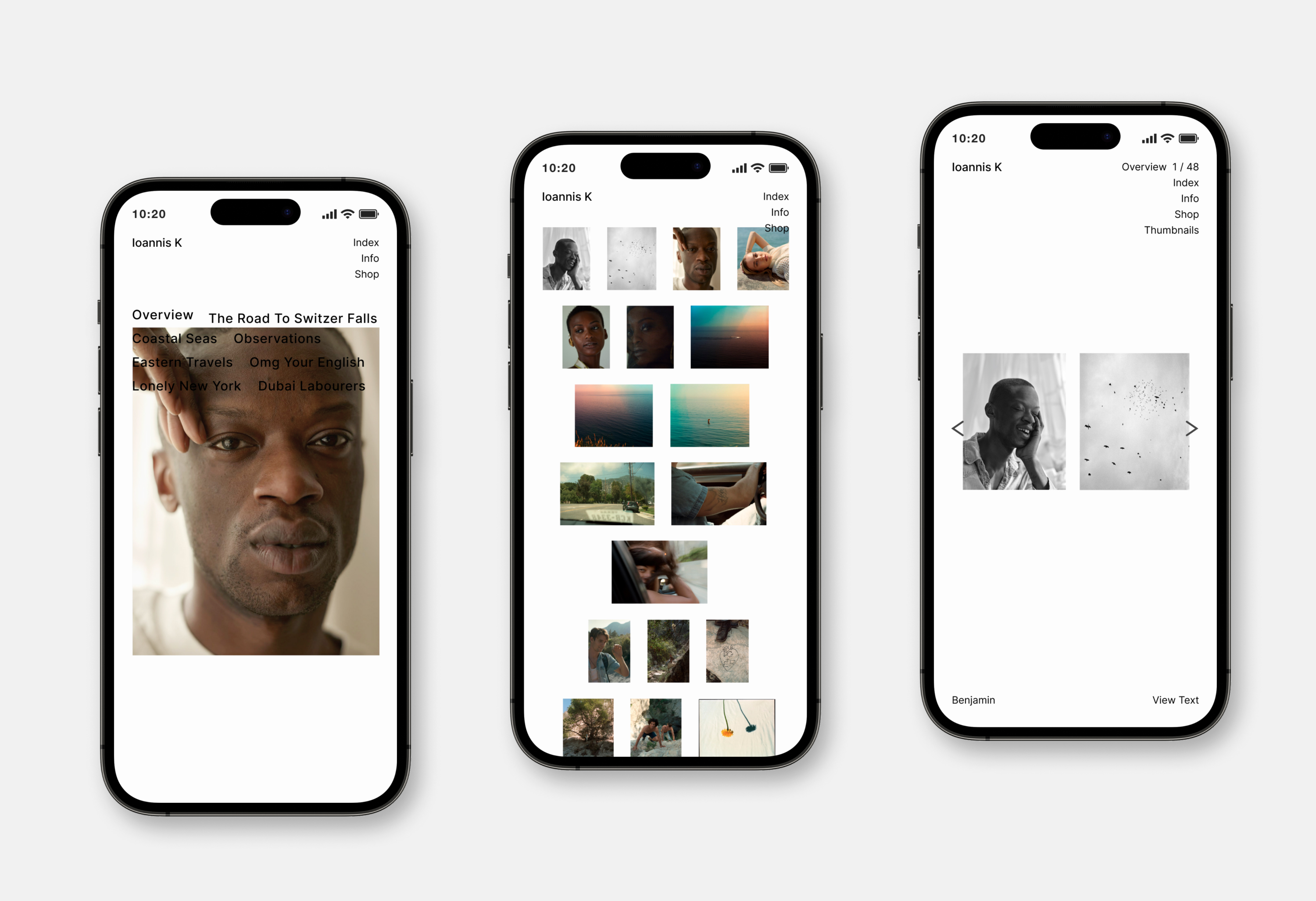
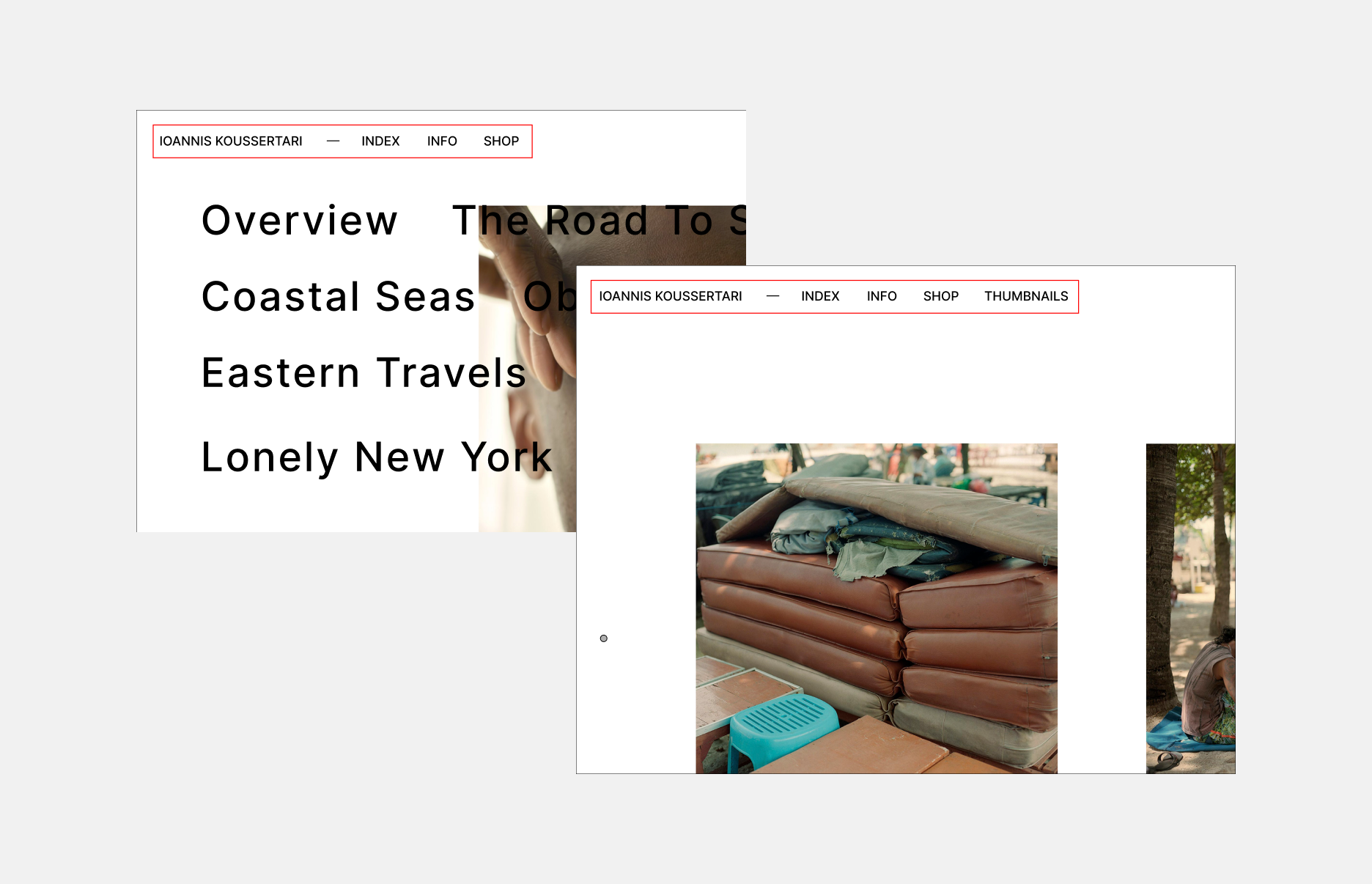
Index & gallery prototype
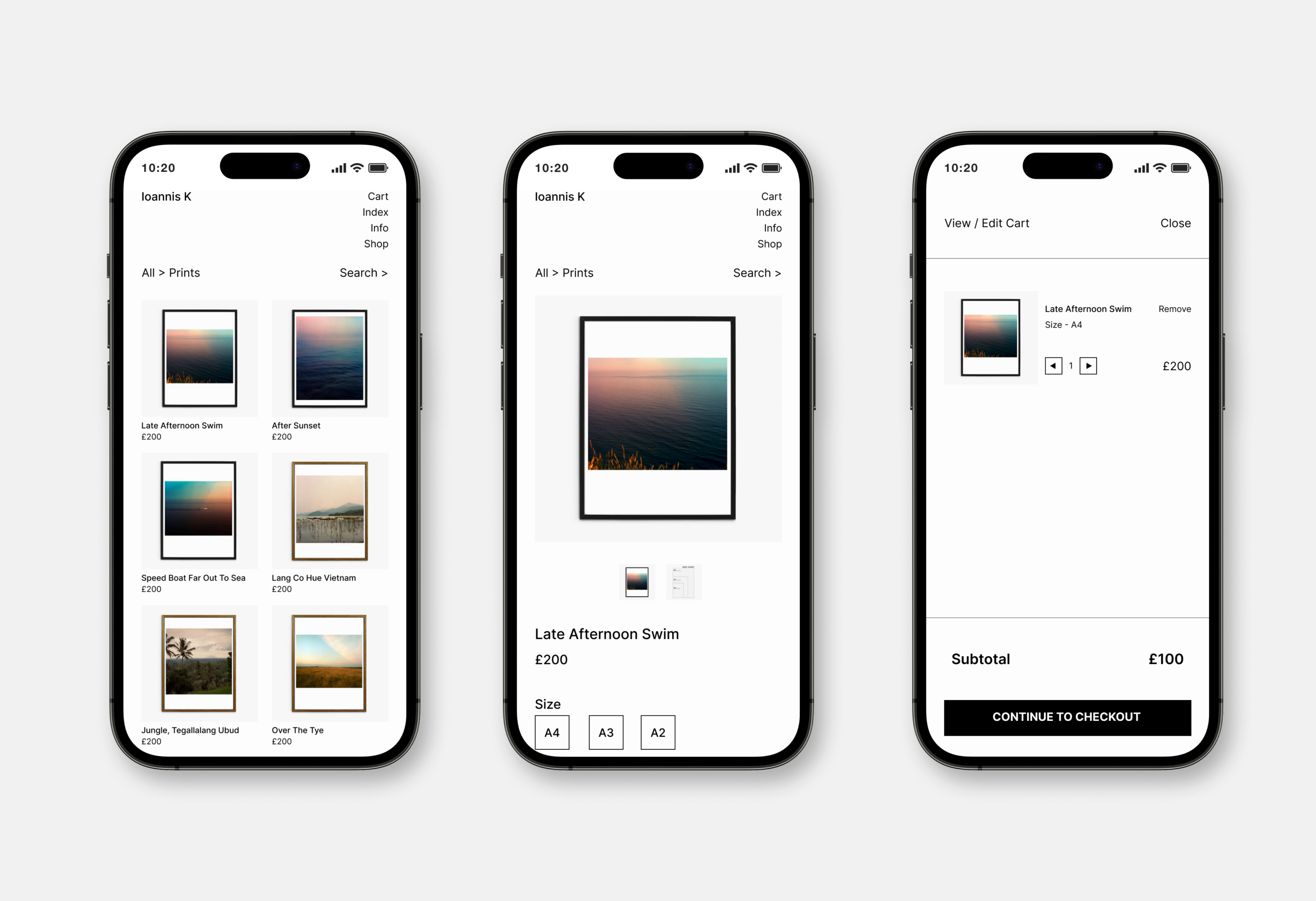
E-shop prototype
Prototype
Results
After launch of the website, I continued to iterate and develop new features based on user feedback and client objectives. Some of these new features included a built in CMS system and further product SEO optimsation for socials.