Avanti West Coast
Enhancing the Journey: Redesigning search input and railcard component for Avanti West Coast.
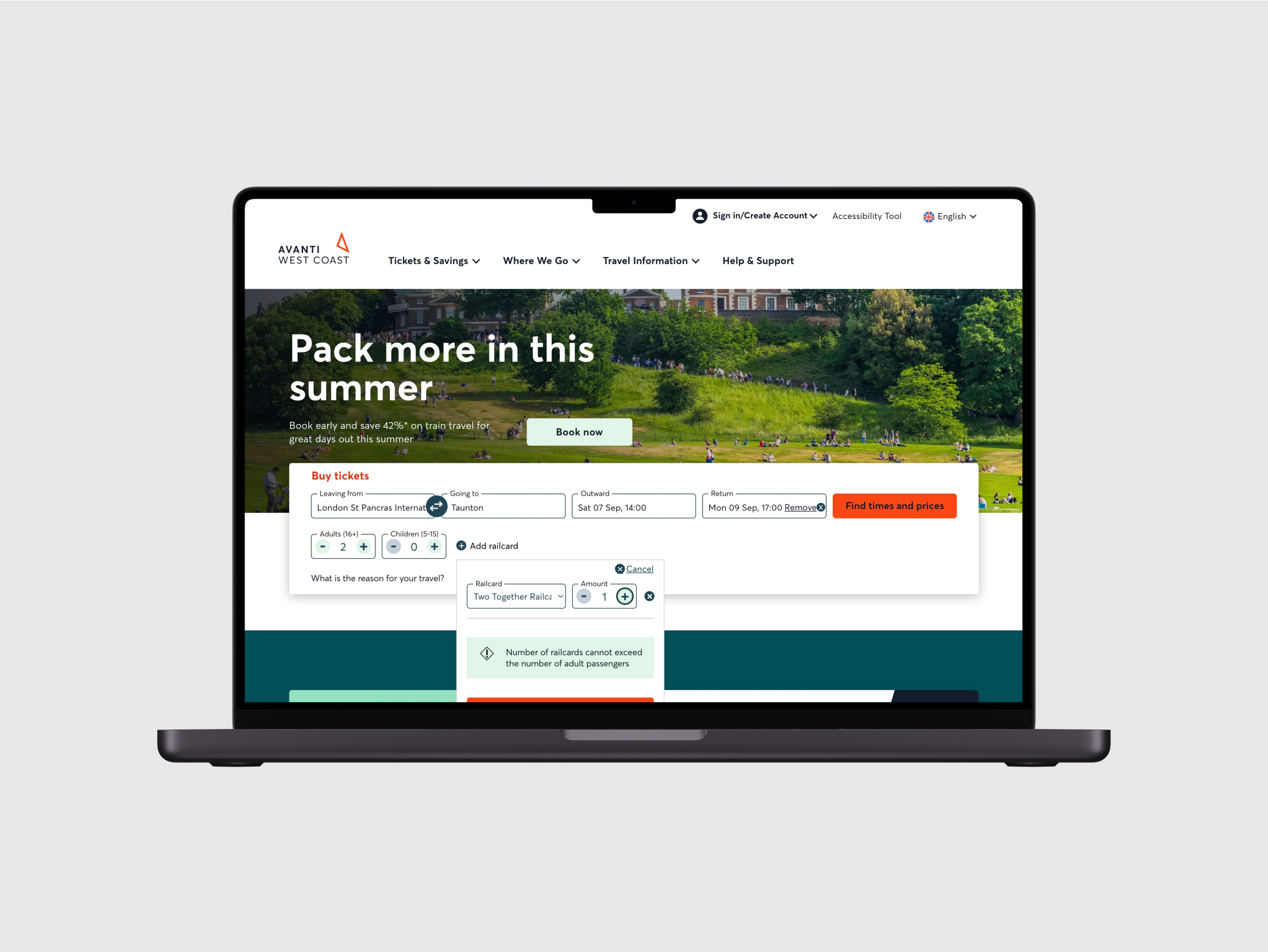
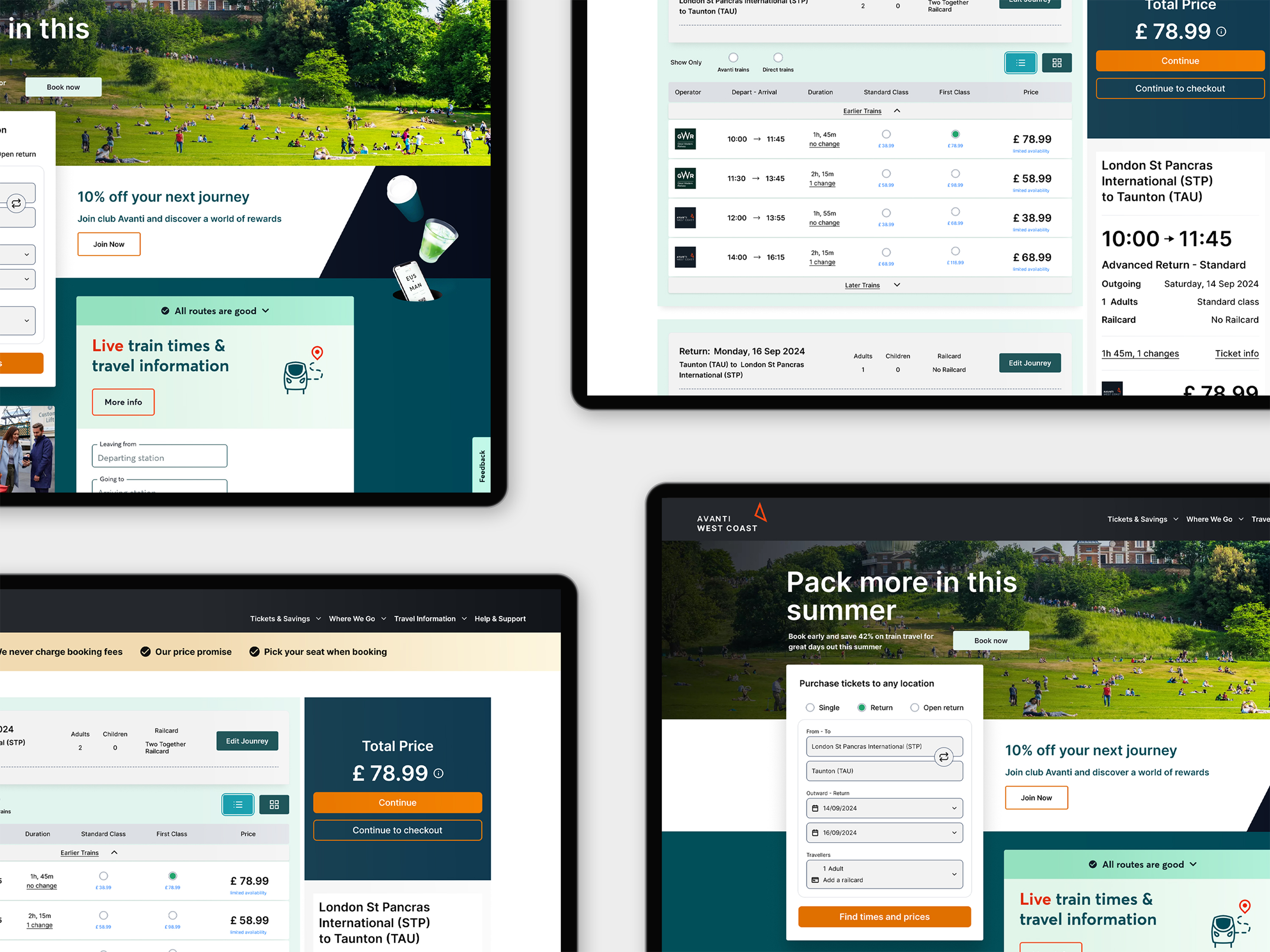
Search and select screen
Client
Avanti West Coast
Project Type
Homescreen journey search input and railcard component.
My Role
Responsible for user interface redesign and improved user experience.
Timeline
2024 - 3 week project
Design Brief
I led the redesign of Avanti West Coast’s journey search input and railcard components, enhancing usability across platforms. My pitch focused on a streamlined, responsive redesign that simplifies search user interactions, reduces click-throughs, and improves overall accessibility. The result? A more intuitive and seamless experience for all users on desktop devices, presented in a functional MVP.
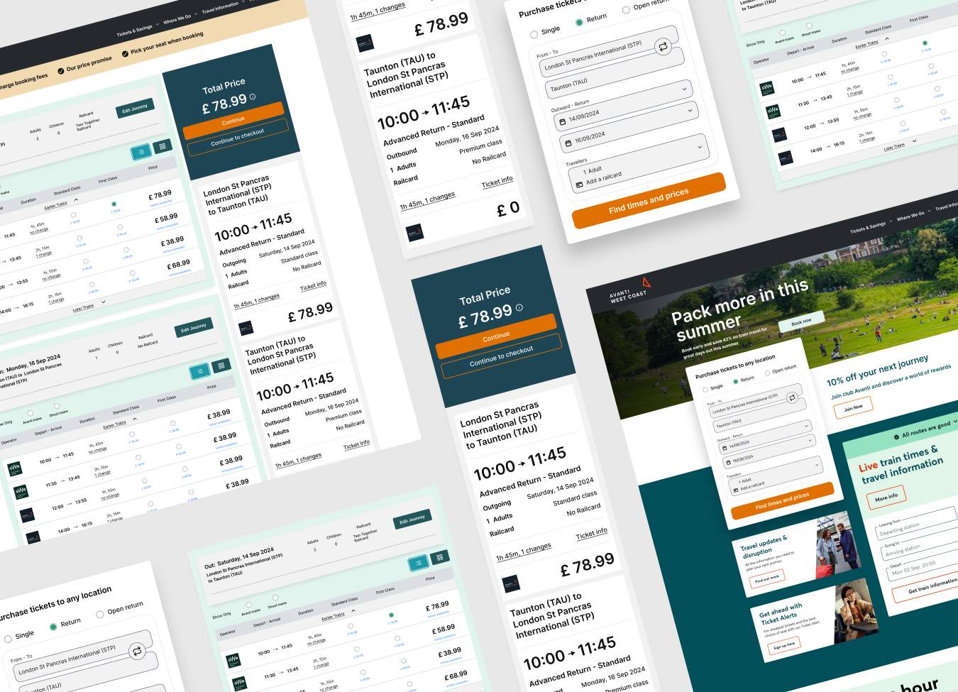
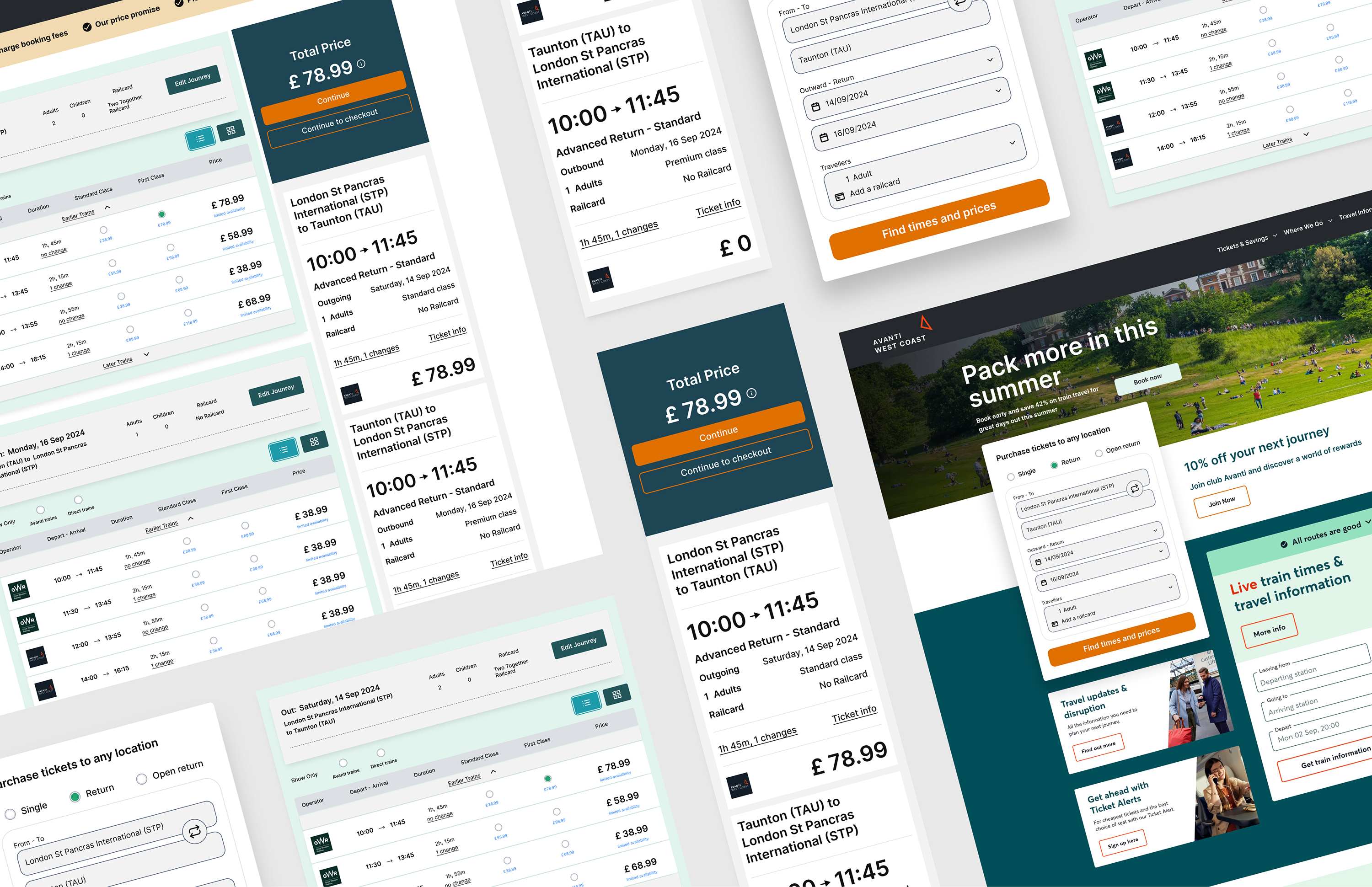
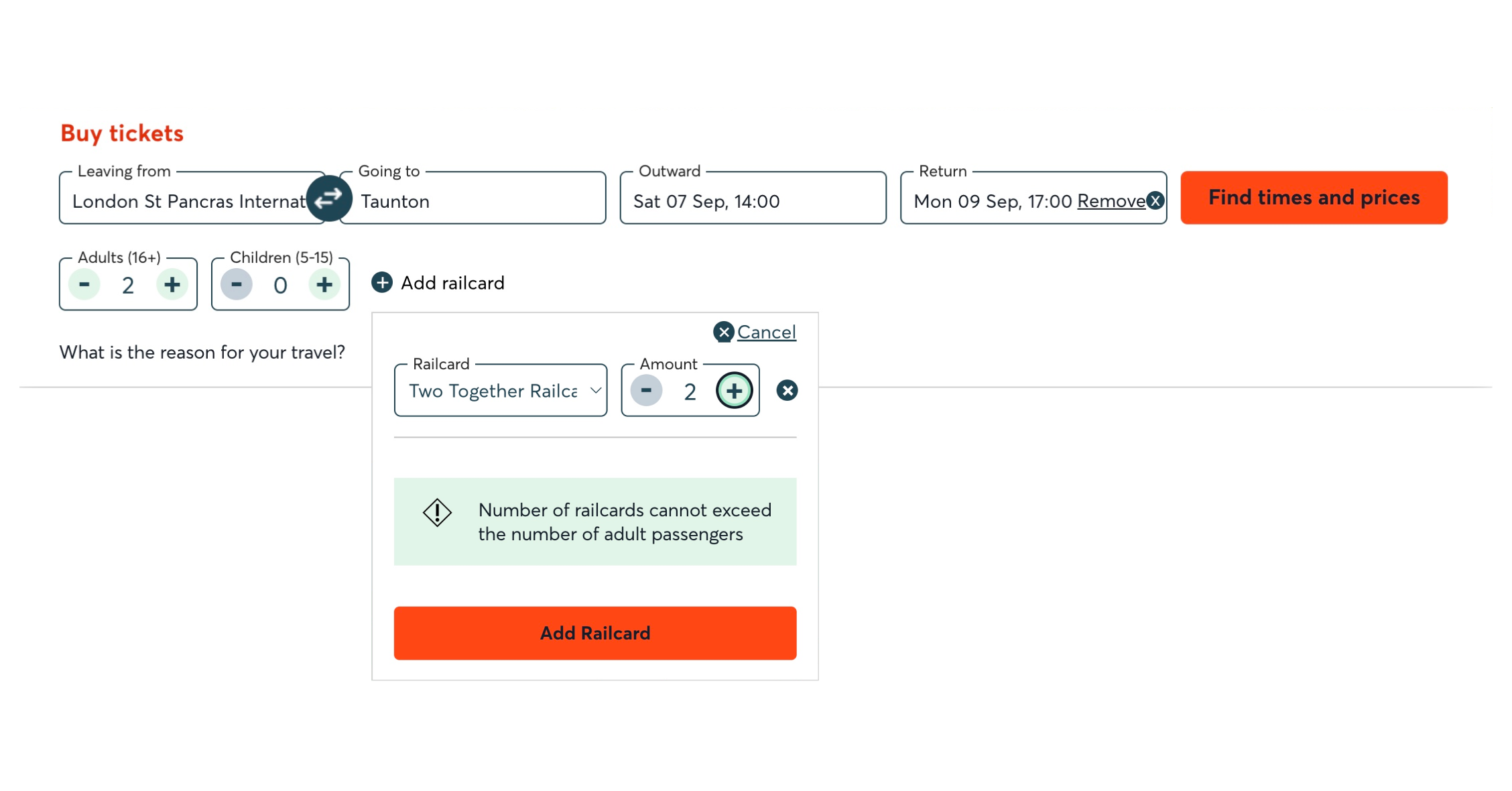
Original Design
The Challenge
Redesign the form structure and functionality of the search input and railcard components to enhance accessibility for all users, particularly those travelling with a railcard.
- Shift the form layout from a full-width design to a compact, stacked format that follows a clear left-to-right, top-to-bottom sequence for better readability and structure.
- Keep the railcard component visible, with sub-level options hidden and revealed only when selected by the user, ensuring progressive disclosure. User selections are displayed on both the search form and the search results page.
- Ensure a smooth journey from ticket selection to payment by simplifying options, interactions and reducing the amount of information displayed, presenting only the essential information needed to complete the purchase.
User Needs
Avanti’s target users for "Two Together Railcard" bookings include adults travelling in pairs, young adults, working professionals, and budget-conscious travellers. Many find the current booking process complex, leading to high dropout rates.
Research and Discovery
I conducted a research audit to evaluate the website’s capabilities, analysing each feature and input field to identify usability issues and highlight areas for improvement. The goal was to streamline the user experience and enhance accessibility across the site.
The Problem Issues
The original website design, though visually appealing, lacked responsiveness on smaller desktop screens.
- Overly complex language and text-heavy content also made the search results difficult to read and caused user dropout before payment.
- The design lacked visible affordances, and the minimal use of colour cues, and error messages impacted usability within the railcard element, revealing significant opportunities for improvement.
- Additionally, the railcard component lacked accessibility, making it difficult for screen readers and keyboard users to navigate or search journey's effectively.
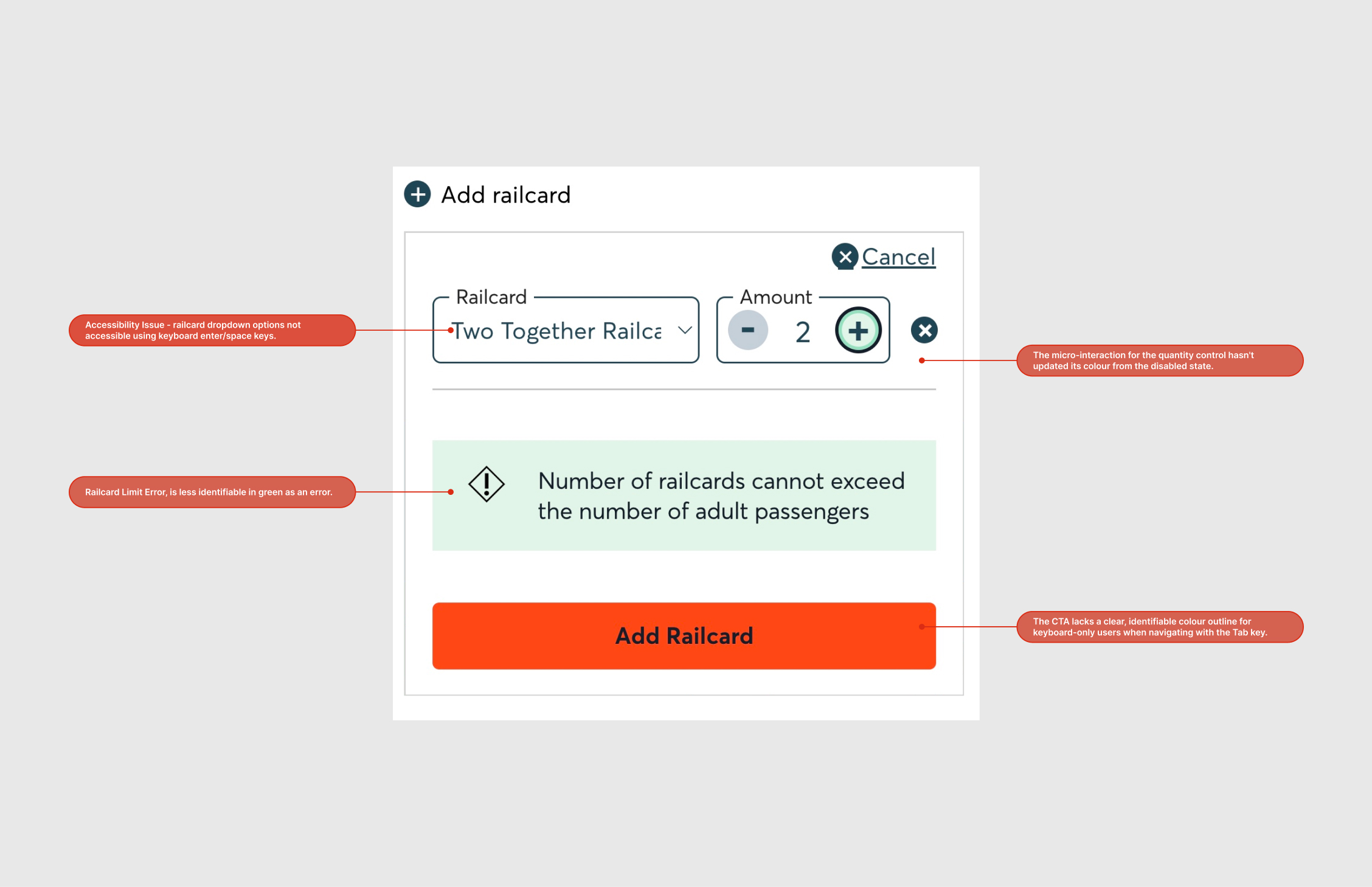
Problem Issues
Audit Findings
An audit and discussions with stakeholders helped identify key areas in the site’s structure and design where reconfiguring the layout could significantly enhance usability, responsiveness and accessibility.
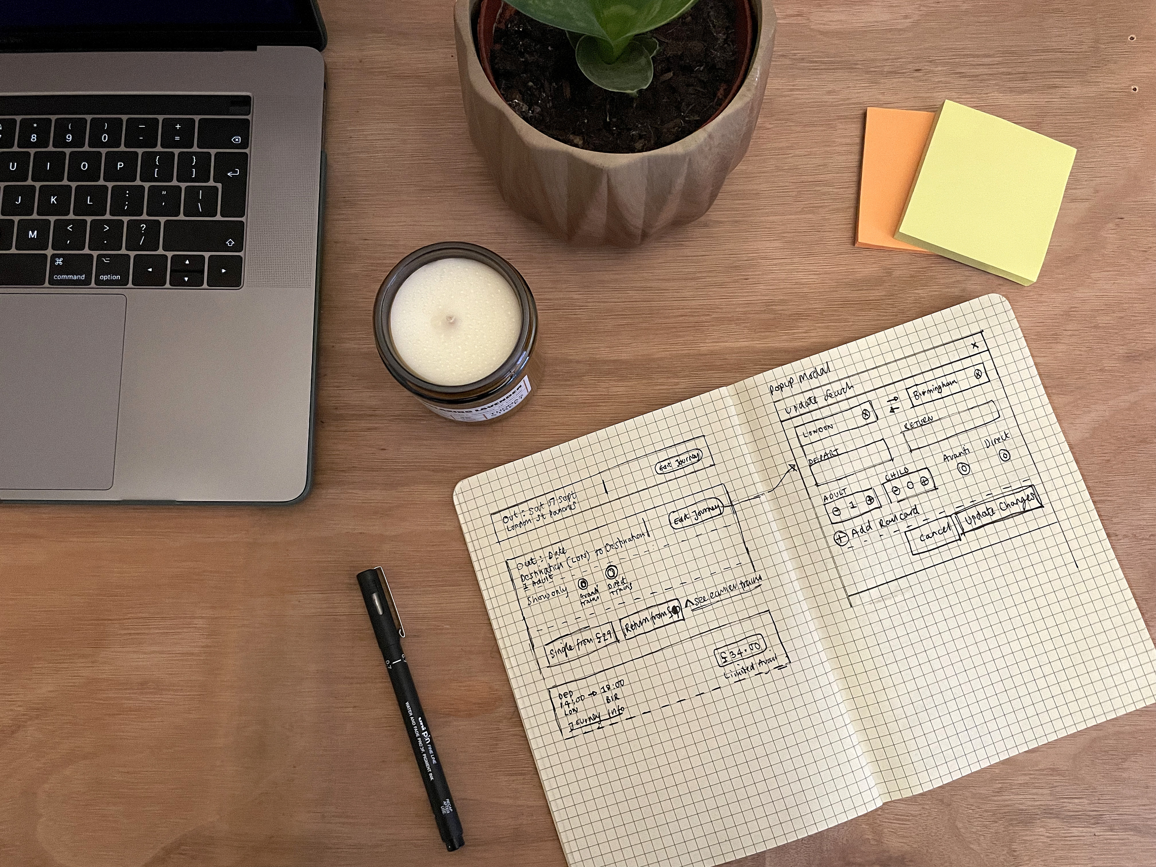
Iteration, ideas & quick sketches
Creating the new design structure
An audit and discussions with stakeholders and development helped to identify key areas in the site’s structure and where reconfiguring the layout could significantly enhance usability, responsiveness and accessibility for those using keyboards and screen readers.
- Simplifying railcard component options, with added constraints, and affordances to self correct.
- Improve accessibility by enabling keyboard navigation and removing inactivity from the current design.
- Enhance usability by applying a formulaic structure that improves readability through a sequential layout, flowing from left to right and top to bottom.
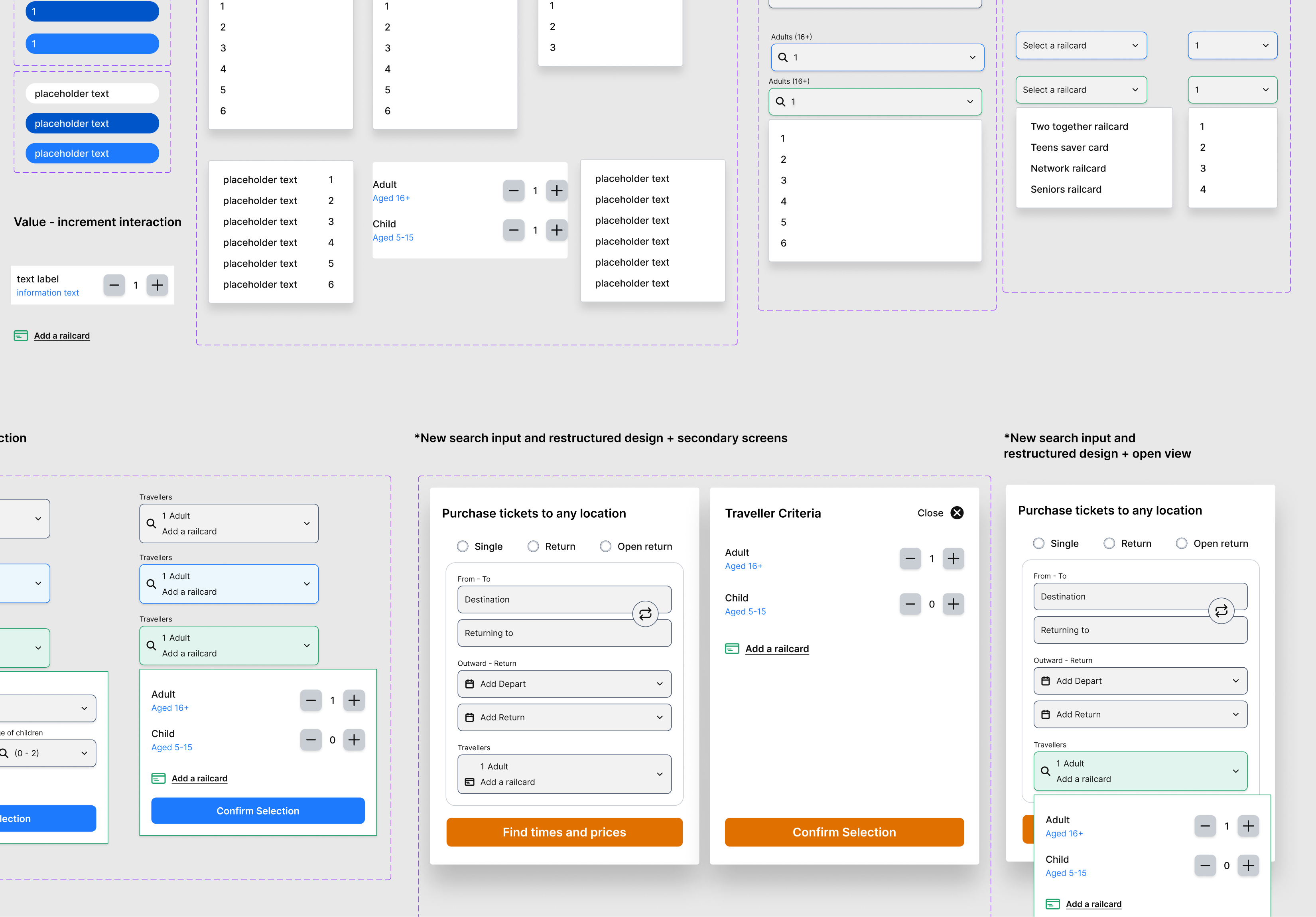
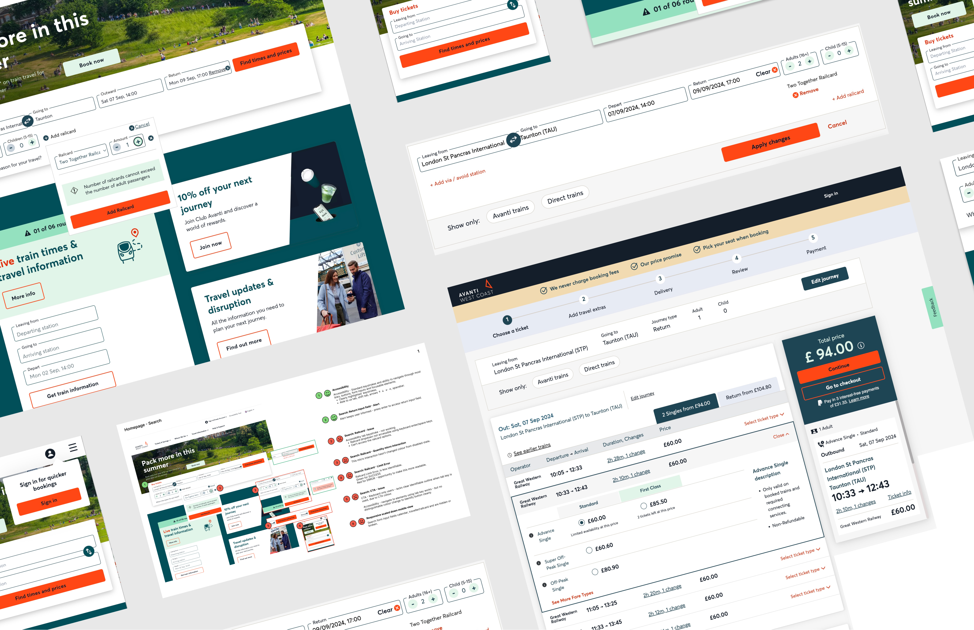
Railcard components & design system assets
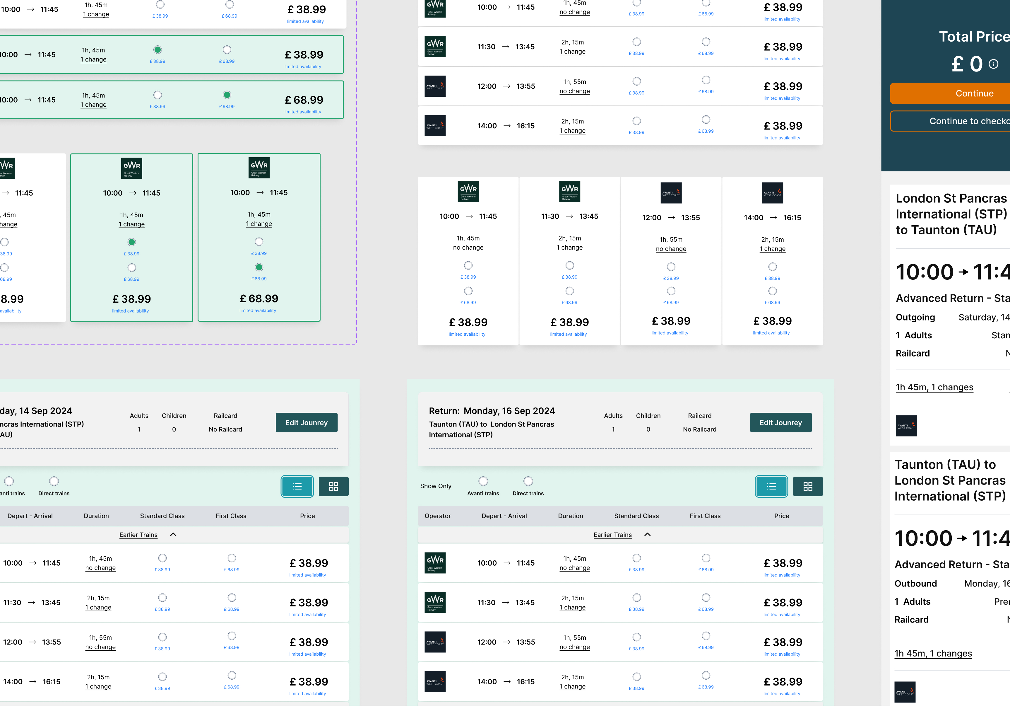
Search results components & design system assets
Design & Documentation
I further developed the component library and design system in Figma, integrating assets with variations and options to illustrate the connection and flow between search and selection.
This reconfiguration of the search selection elements and railcard component demonstrated enhanced usability and responsiveness across different screen sizes.
The redesigned layout improves readability and addresses prior railcard accessibility issues, making navigation smoother for keyboard and screen reader users. This updated configuration incorporates native app styling, seamlessly integrating secondary and sublevel screens within the form structure for a more cohesive user experience
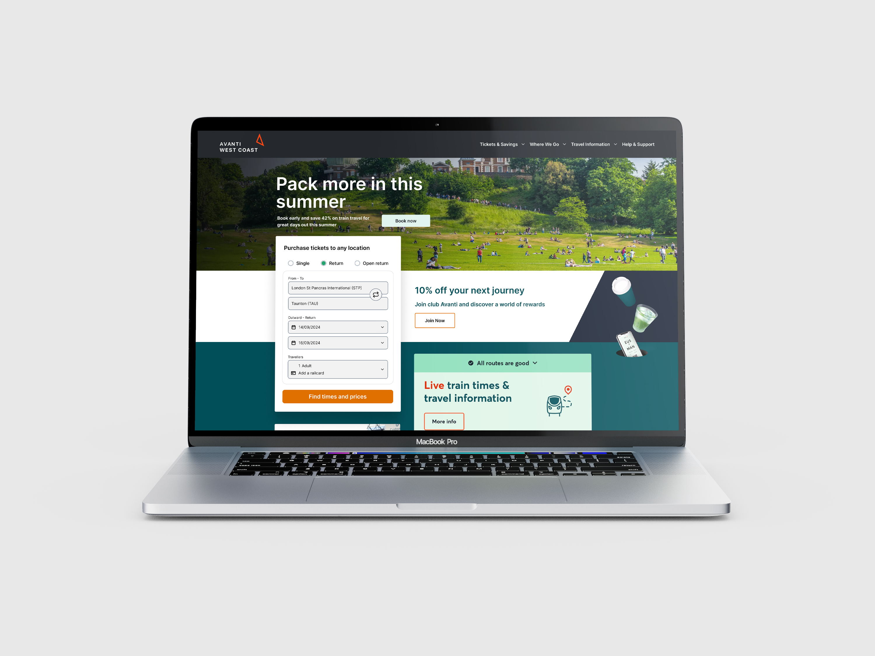
Search and select screen
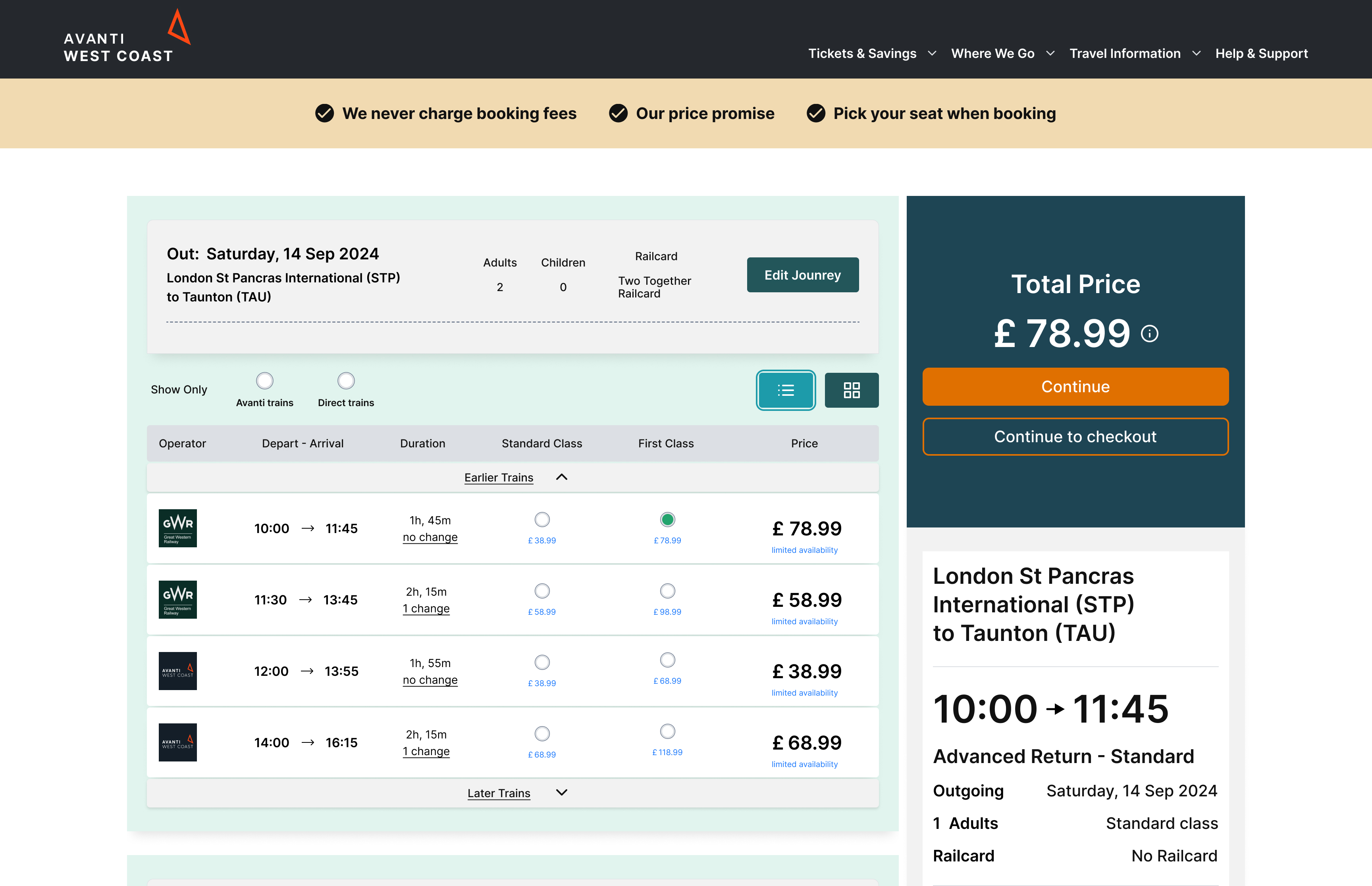
Search results screen
Ipad Devices
MVP railcard prototype
Conclusion
The redesigned search, select, and railcard components were presented in a stakeholder meeting to review the new design. The MVP showcased solutions, component customizations, and enhanced usability features to improve readability and accessibility for all users. Despite the ambitious design and pitch, Avanti decided to proceed with another designer for the project, choosing to retain their existing organisational design and structure, which excluded accessibility enhancements and other proposed improvements.