Anima healthcare
Anima Healthcare reimagined – a state-of-the-art app dashboard redesign blending
personalised medicine with a
health-conscious focus.
Client
Anima Health
Project Type
App onboarding & home screen dashboard.
My Role
Responsible for UX design and the
delivery of UI dashboard designs.
Timeline
2022 - 2 week project
Design Brief
Welcome to the Anima, a healthcare app focused on the user first. The main goal was to redesign the main screen of a coaching and personalised medicine app that health-conscious users would love. A responsive mobile-first approach that guides users between appointment booking with their local GP, monitoring daily health activity and searching for general health information.
Design pitch - two week project to reinvent an easy-to-use health app framework for users. Creating an app users would use daily to guide, search and monitor their healthcare needs in one space.
Original Product
The original website design was outdated and introduced user issues functionality issues navigating between the homepage and websites subsections.
Research Survey
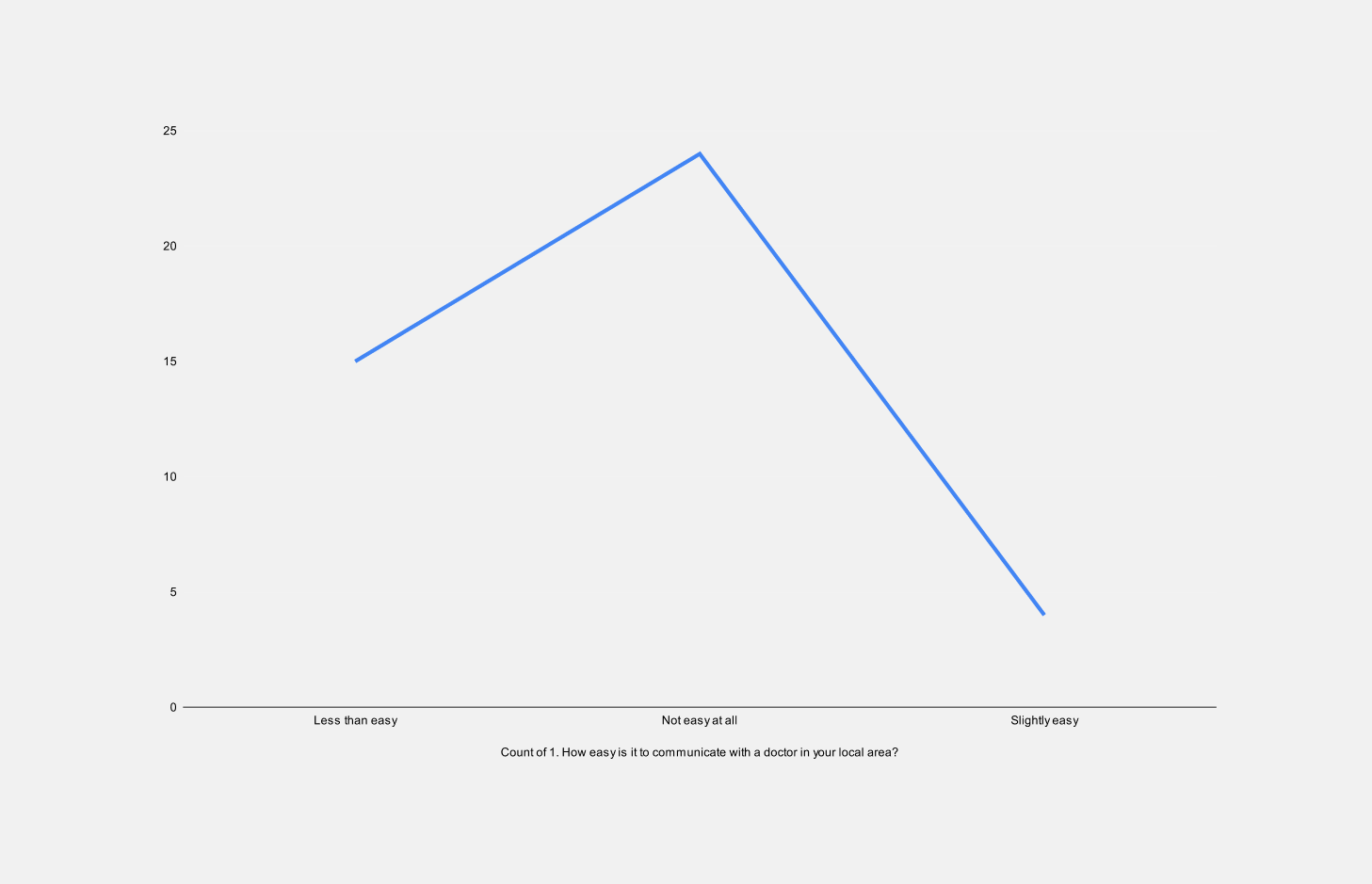
Aside from functionality, there were further communication issues rooted in the service. Performing deeper research in the form of an online survey in our local area enabled us to gain insight into user issues and their underlying goals with their current healthcare plan. 58.8% of users found it 'not easy at all' to book an appointment with their local GP due to poor communication with over 60% poor to average care provided.
Use Cases
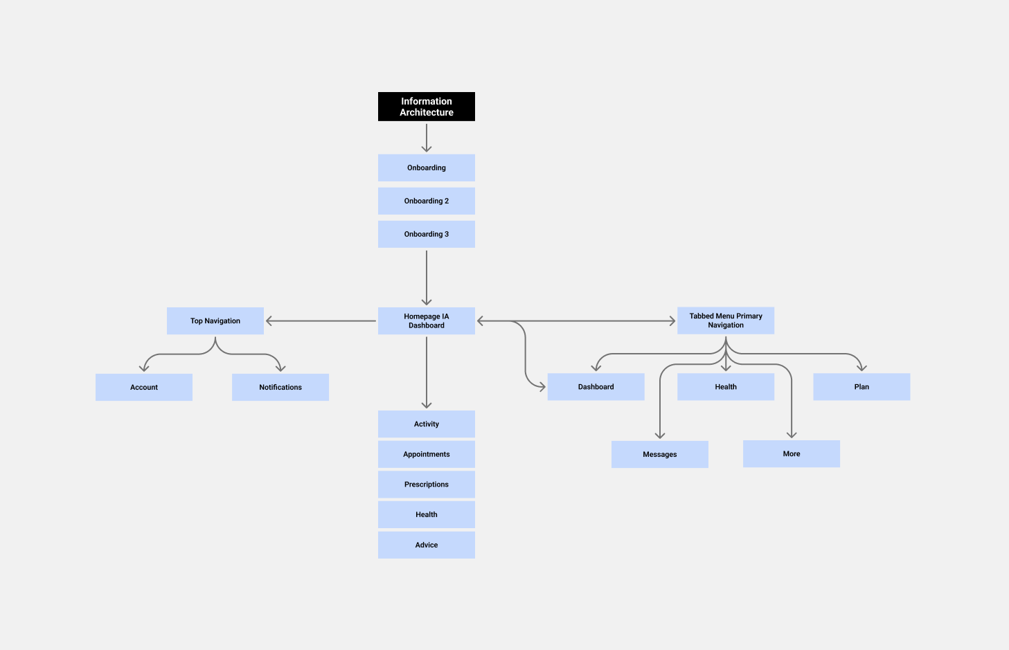
With multiple use cases, it was important to narrow down the top 3 and look at these based on user needs, usability and scalability. General healthcare information, communication and the online booking process presented the main key use cases to focus on. It made sense to create a workflow with nested lists that lead users to more detailed content through linear paths.
Online survey
IA
Onboarding
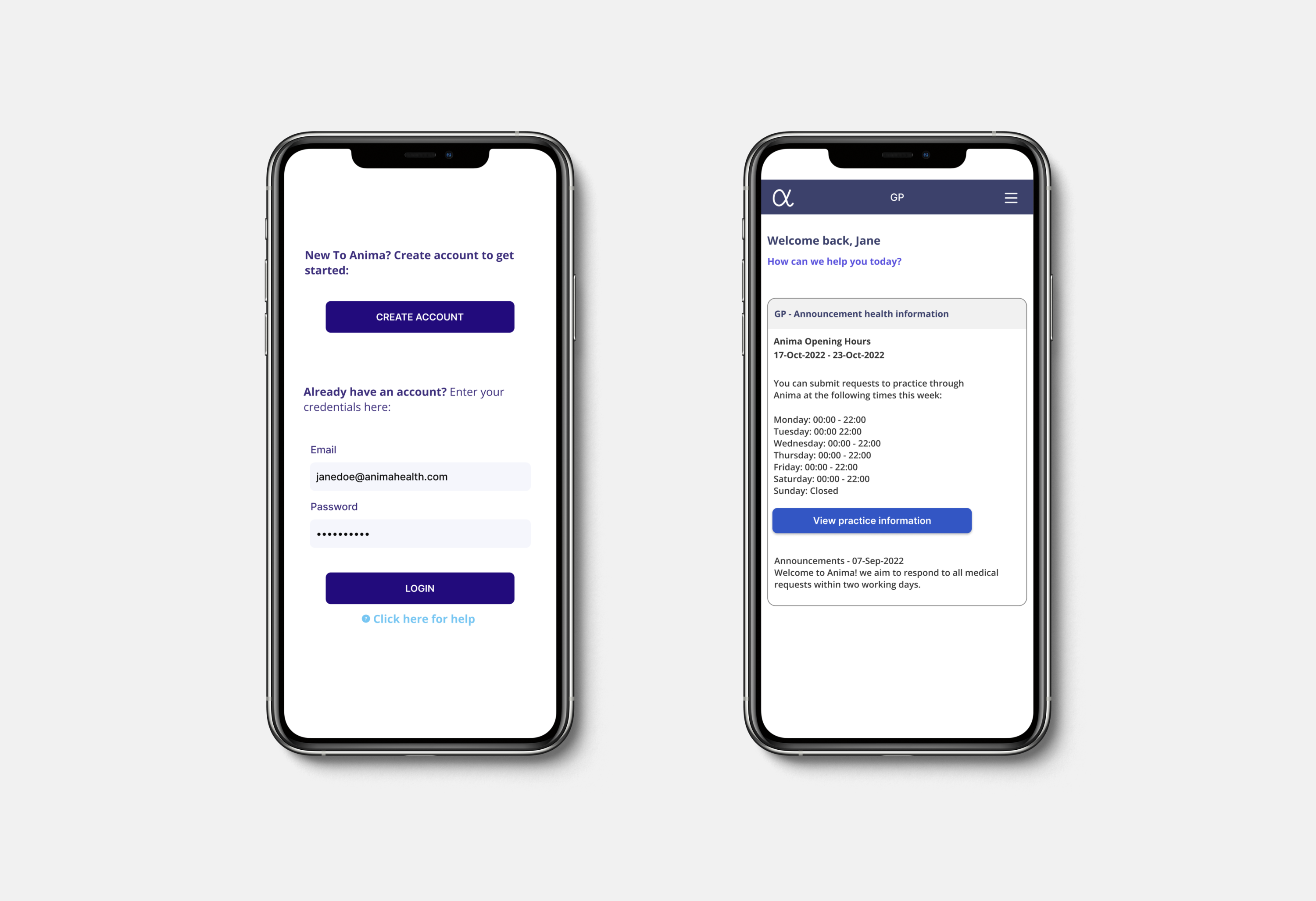
By simplifying the website's current information architecture, I was able to simplify the necessary steps through onboarding and primary booking online. For new users signing up, onboarding also presented an opportunity to gain users' personal information, i.e. age, height and location. This information's used privately to build user profiles with more personalised features. The user flow below displays steps taken by new and repeat users through the login and home screen process.
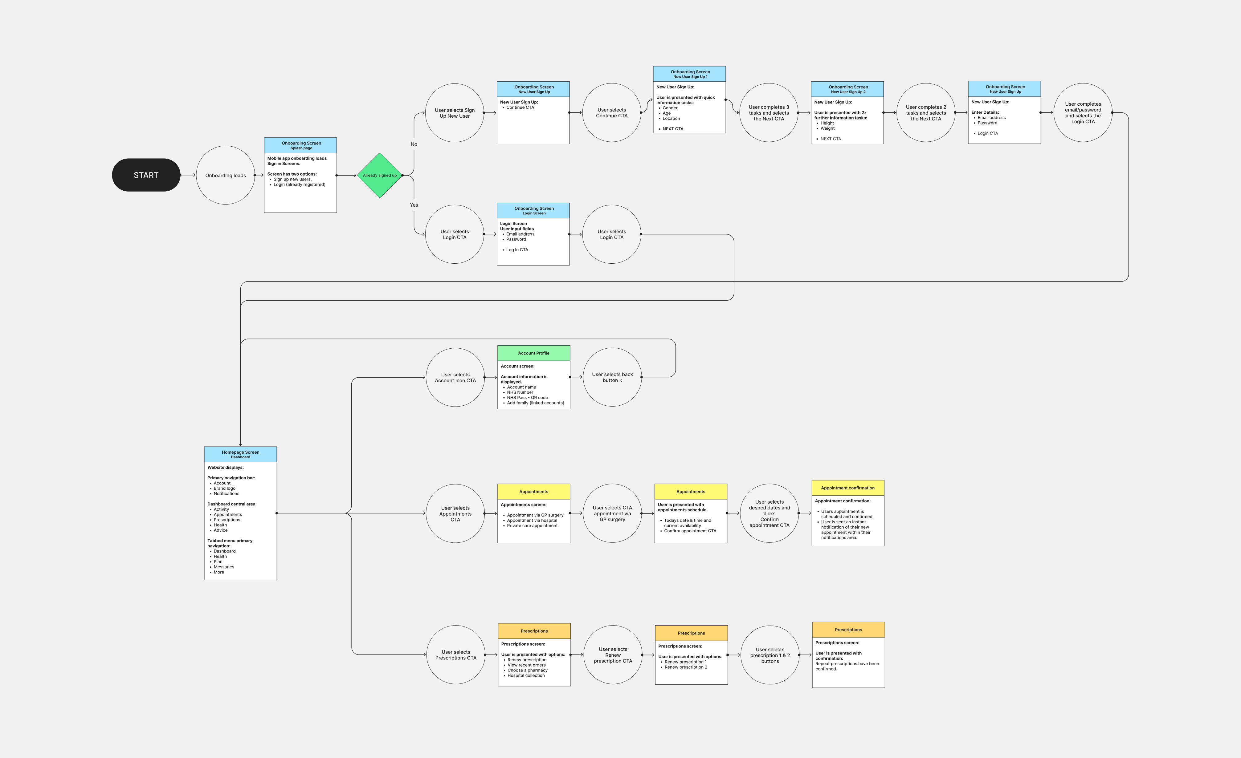
User flow
Goals of redesign
Users wanted to track their health, their activity and be able to communicate directly with their general practitioner to make an appointment or order a repeat prescription. Combining general health and fitness with up-to-date information in one defined space could provide users with a modern means of self-care. Users could track their fitness activity, monitor their health and schedule a consultation with their GP for advice via a simple booking app.
Questions to ask?
- Is the app accessible, user-friendly and easy to learn?
- Is the app evidence-based - supported by NHS?
- How does the app support its subscriber i.e. with helpful resources and video tutorials?
- How does the homes creen dashboard system guide users i.e. simplified functionality with granular language.
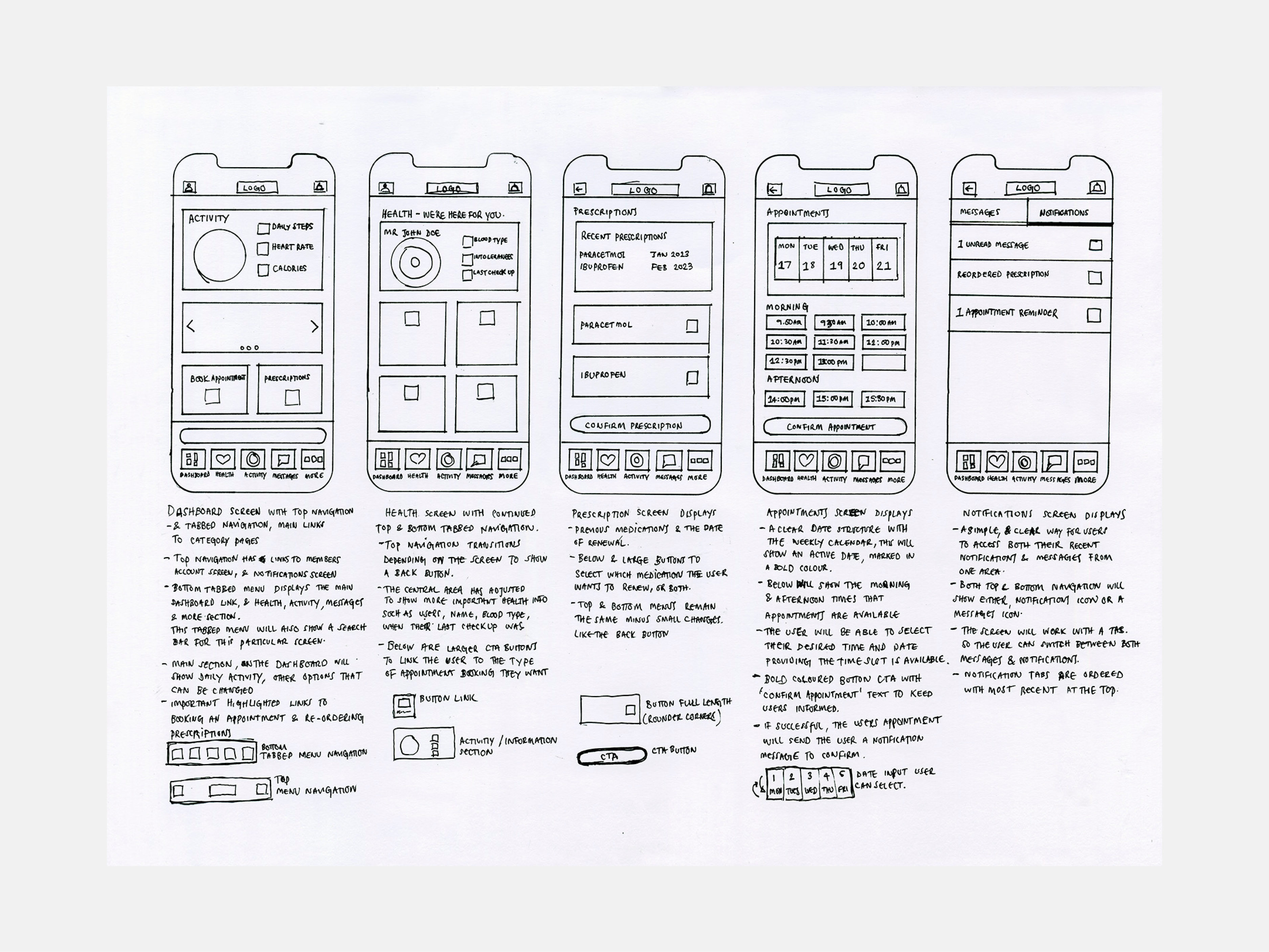
Sketches
Onboarding prototype
Now with a defined path and structure, I was able to display a quicker more efficient route. With functionality, health advice and online booking neatly wrapped up in the mobile dashboard and tabbed menu.
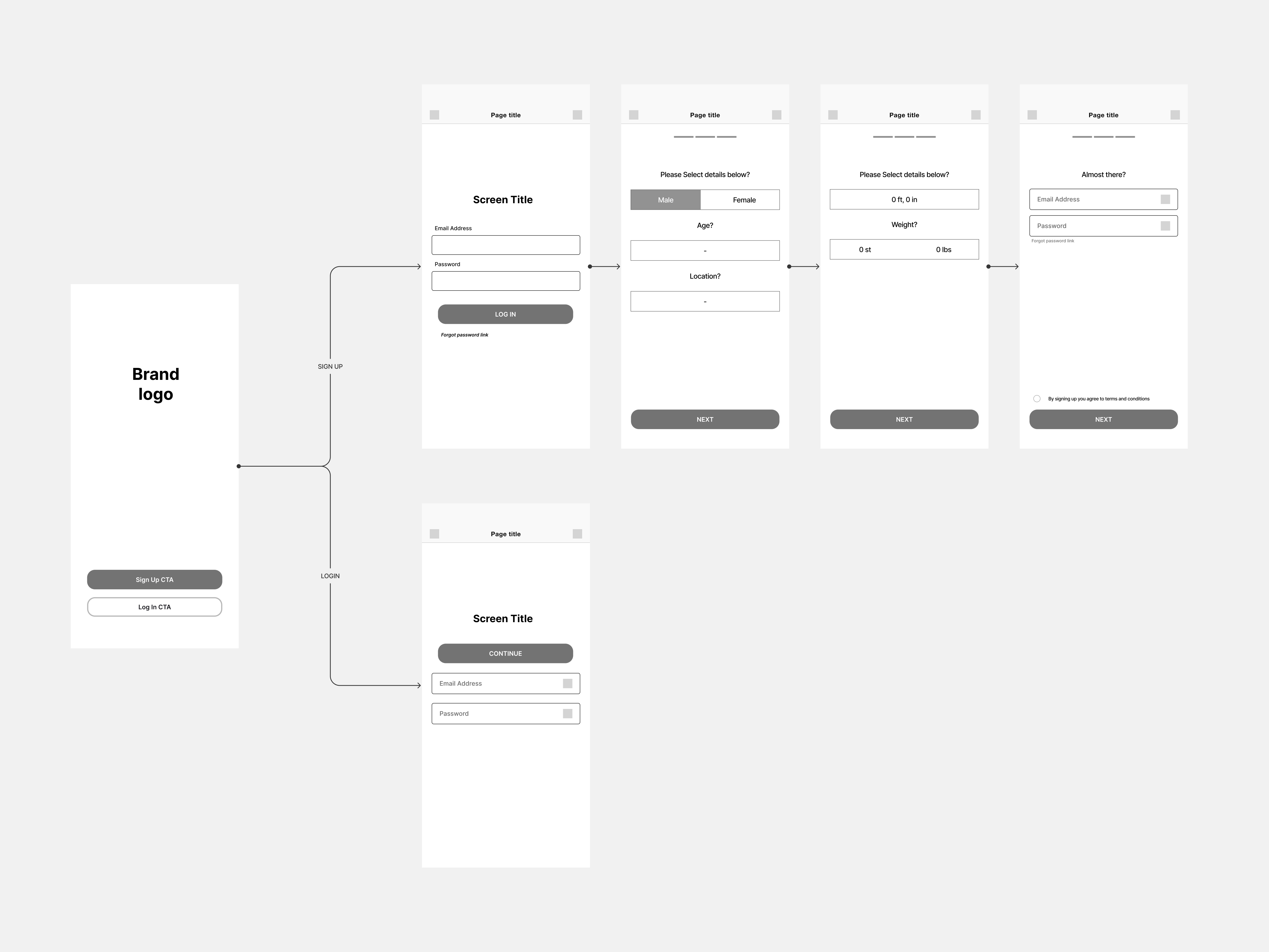
Lofi onboarding
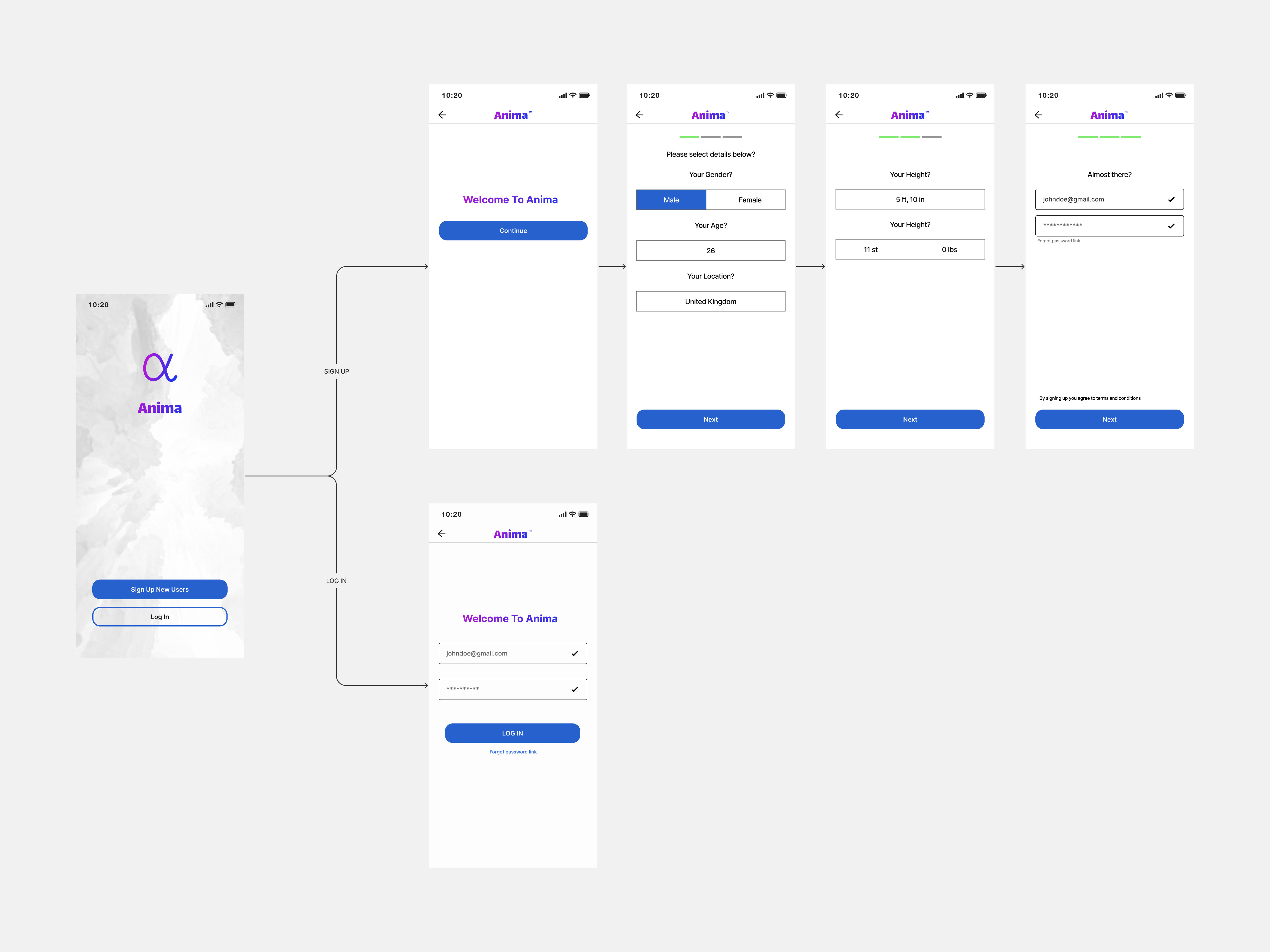
Hifi onboarding
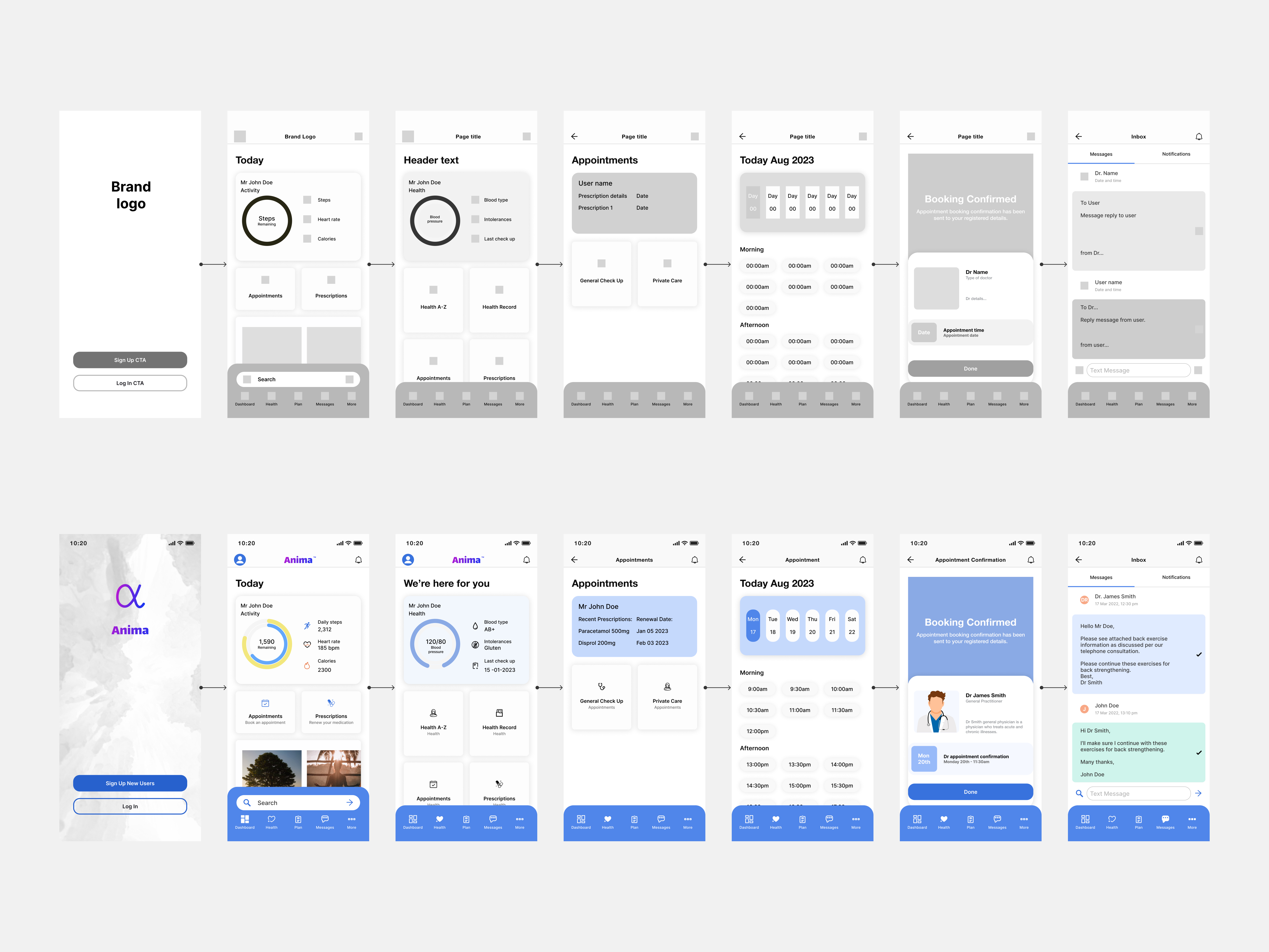
Home screen dashboard wireframes
Now with a defined path and structure, I was able to display a quicker more efficient route. With functionality, health advice and online booking neatly wrapped up in the mobile dashboard and tabbed menu.
Wireframes
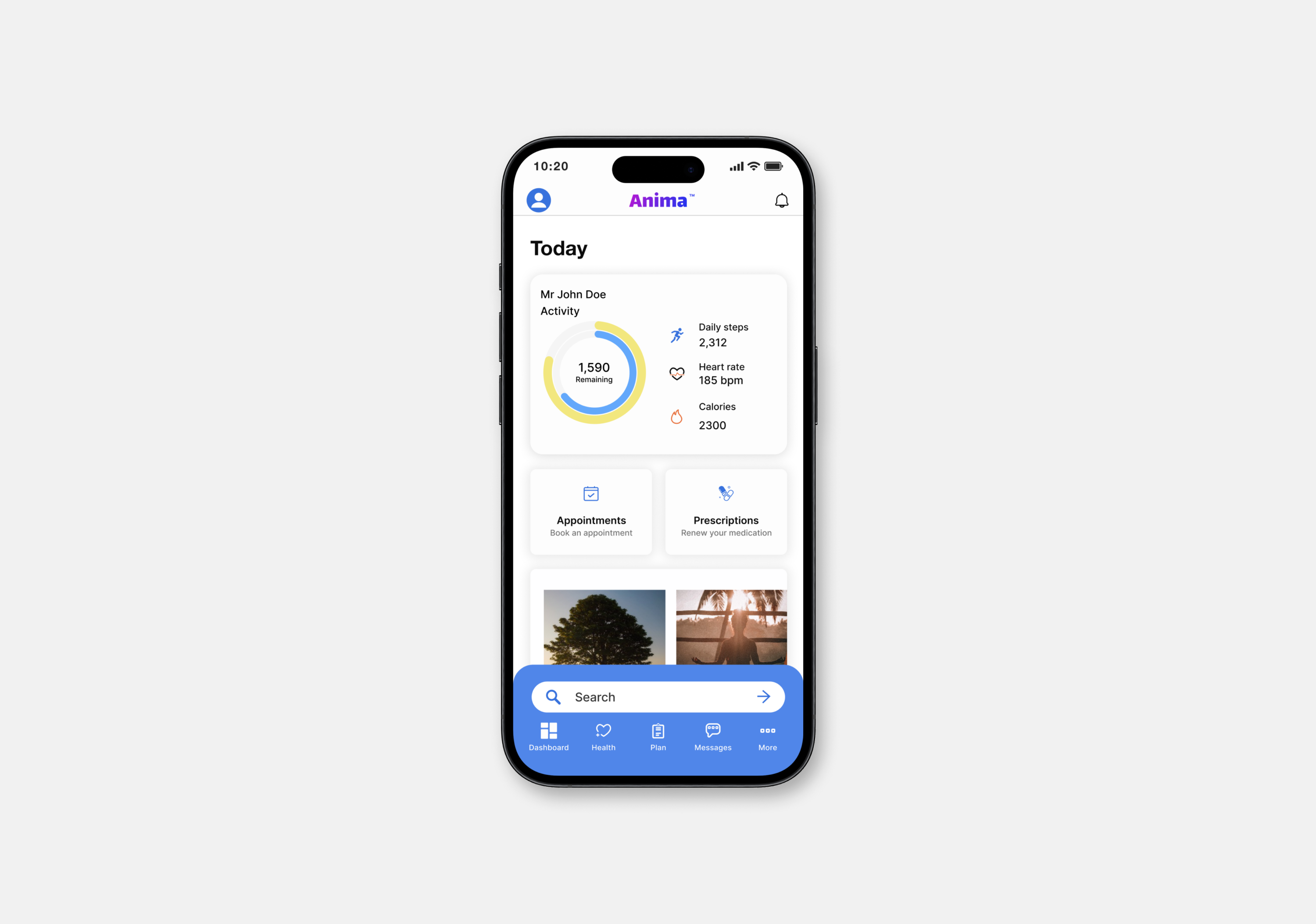
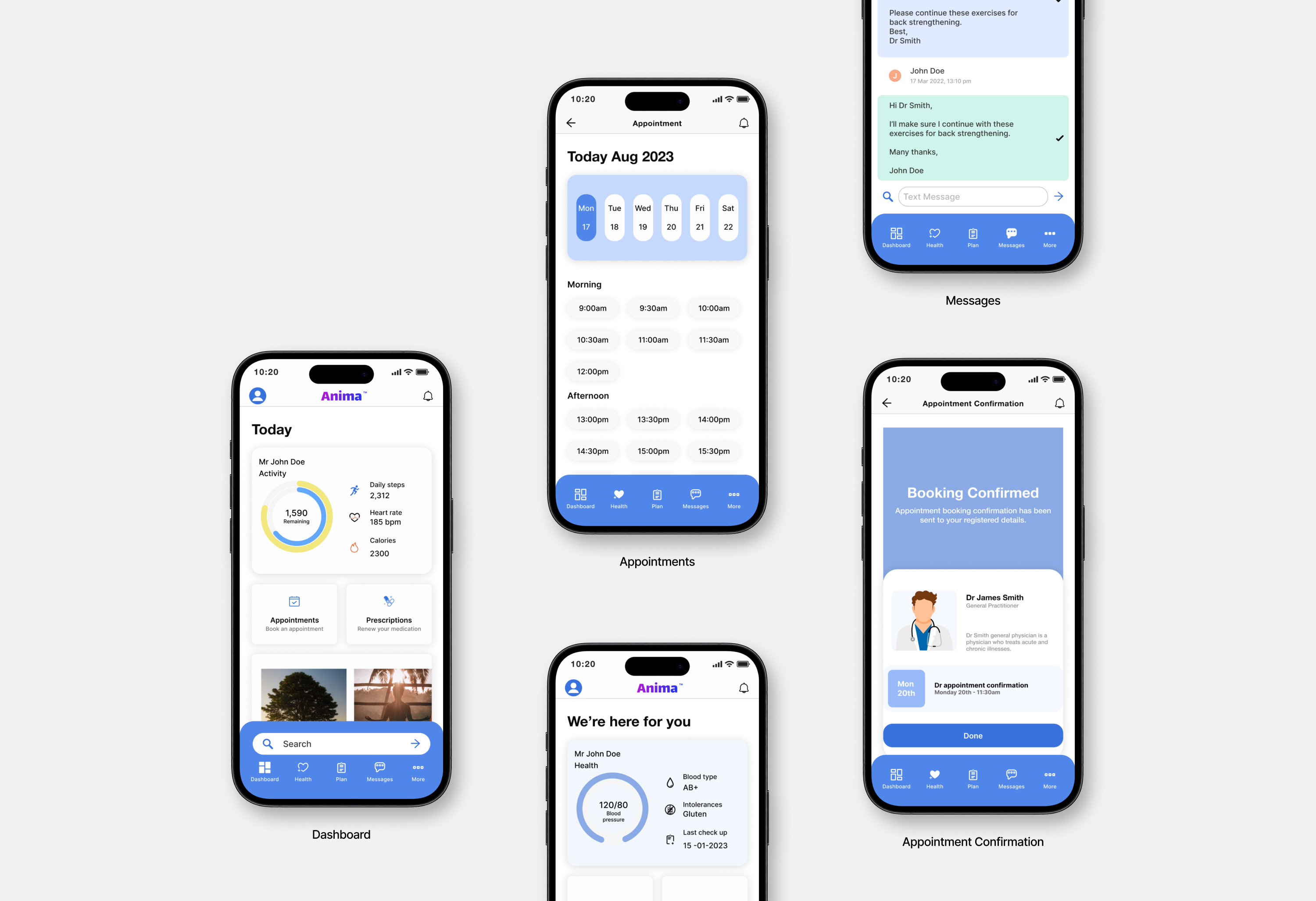
Home screen dashboard
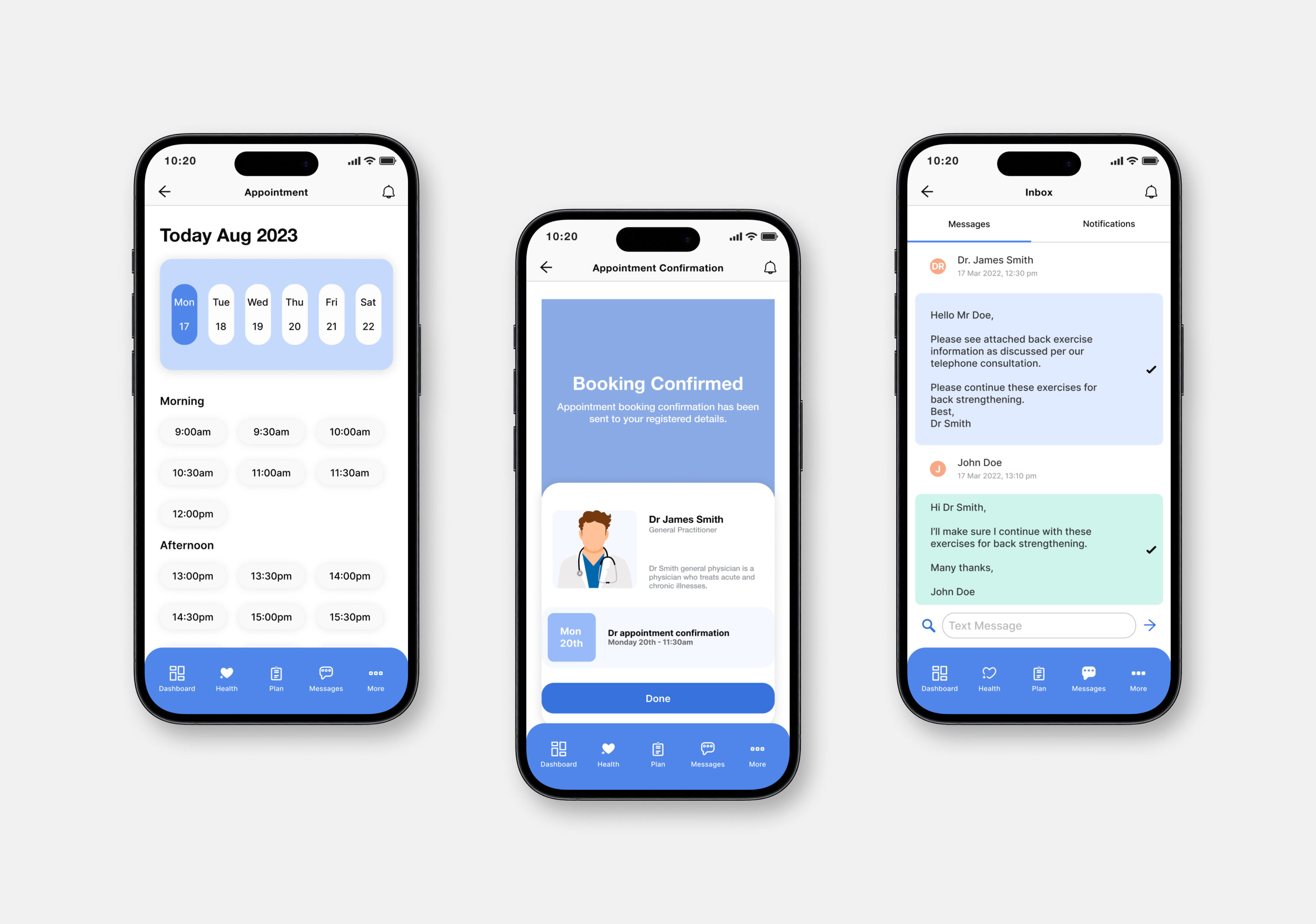
Appointment screens
Final MVP
Now with a defined path and structure, I was able to display a quicker more efficient route. With functionality, health advice and online booking neatly wrapped up in the mobile dashboard and tabbed menu.
Prototype